Opsview 6.8.x End of Support
With the release of Opsview 6.11.0 on February 2025, versions 6.8.x have reached their End of Support (EOS) status, according to our Support policy. This means that versions 6.8.x will no longer receive code fixes or security updates.
The documentation for version 6.8.9 and earlier versions will remain accessible for the time being, but it will no longer be updated or receive backports. We strongly recommend upgrading to the latest version of Opsview to ensure continued support and access to the latest features and security enhancements.
Dashlets
By default, the Dashboard offers various types of Dashlets: Overview and Technical. If you have enabled the Flow Collectors functionality, some additional Flow Collector Dashlets are enabled.
Overview Dashlets Copied
These Dashlets are available in the second drawer called ‘Overview’ under the ‘Configuration’ area on the left-hand side. For details about the BSM dashlets, go to BSM Dashlets. The other dashlets are documented below:
Process Map Copied
This Dashlet allows you to upload an image to Opsview Monitor and overlay the monitored data onto the image. This data includes:
- Hashtags
- Host Groups
- Hosts
- Services
- Performance Metrics
Example usage 1:
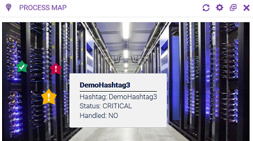
You could upload an image of a rack, for example, and create a ’live status’ map of the rack using the health of the monitored Hosts that are within the rack, as below:
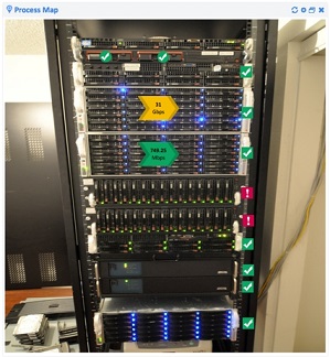
As you can see, on top of the picture, various metrics have been added to reflect the health and performance of the objects within the rack. This allows you to not only see datashelf1 is down but where that is within a given rack thus reducing the time-to-resolution, should it need physical intervention.
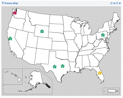
Example usage 2:
You can use a Hashtag per data center or office, and using a map of the country, you can then see the health of each location based on objects within the given Hashtags:
Adding and configuring a Process Map Copied
To add a process map to your Dashboard, simply drag the dashlet onto the Dashboard.
The following Dashlet appears by default on the Dashboard:
To configure this Dashlet, click on the ‘cog’ icon in the Dashlet’s header:
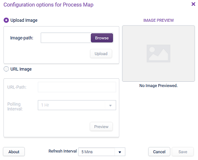
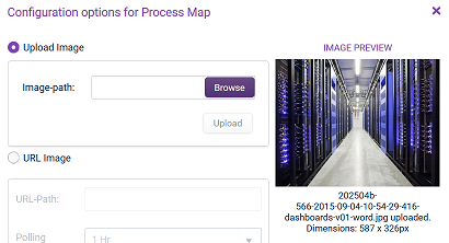
You first need to add an image and once this is done, you’ll be able to overlay metrics. To upload an image, you can use Upload Image: click the ‘Browse’ button to select a jpg or png image and click ‘Upload’. The ‘Image Preview’ panel will show the image for your confirmation:
URL Image: this allows you to enter the full path of a web-based URL. This image will then be downloaded on a regular defined ‘Polling Interval’, meaning that the Process Map image will be updated each time the image changes on the website. Once you have entered the URL, click on ‘Preview’ to see how the images will show within the Dashlet.
Once you are happy with the image, click Save. The Dashlet is now updated.
Note
The image will be stretched to fill the entire space of the dashlet, so it is better to have images that roughly match the desired aspect ratio of the dashlet. The height of the dashlet is stored as a ratio, so if the column widths change (from a browser width change, or opening/closing of the dashlet drawer), the height of the dashlet will proportionally change as well.
You can now overlay metrics onto the image. Right-click on the image and select what data you wish to monitor on this Dashlet:
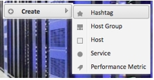
You can add as many Hashtags, Host Groups, Hosts and Services as necessary. As an example applicable to the other objects, adding a Hashtag will display the following configuration window where you can select a pre-existing Hashtag and the size of the image that will be shown on the Dashlet image:
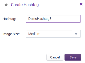
Click Save and move the image overlay where relevant on the Dashlet image:
When you are adding Performance Metric, the following window is displayed. You can choose a specific Service Check on a specific Host, and determine a custom label along with other options including arrow direction, arrow size (“Image Size”).
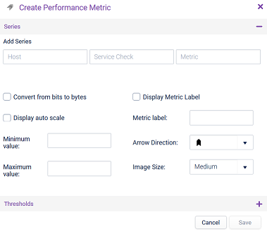
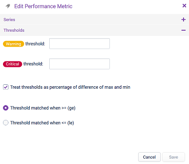
You can also configure Thresholds for the numbers specified, for example, if you are displaying network throughput with this Performance Metric, you can write “If traffic goes about X, change the arrow to yellow or WARNING, if it goes about Z, change the arrow to red or CRITICAL”.
Click Save and move the image overlay where relevant on the Dashlet image:
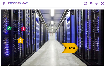
Right-clicking on an overlay allows you to Edit or Delete it from the Process Map.
Hashtag Tree Map Copied
This Dashlet displays a visual representation of the health of the Service Checks within one or more Hashtags within the Opsview Monitor systems:
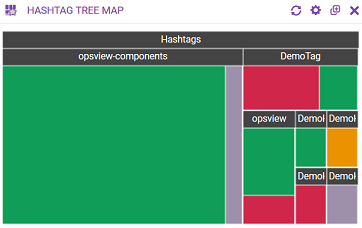
The size of the cell is proportional to the number of Service Checks within the given Hashtag in a certain state.
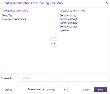
To configure this Dashlet, click on the cog icon in the Dashlet’s header. You can then choose which Hashtags you wish to display in this particular Dashlet:
Note
If no hashtags are specified, only the first 100 hashtags will be retrieved. If you configure a specific list of hashtags, there will be no limit.
Instead of selecting each hashtag one by one, you can use the Search box type in a string that will include every hashtag matching that string. This means that when you add a new hashtag that matches this Search string, the hashtag will be automatically included on this Dashlet.
On the Dashlet, you can:
- Hover over each Hashtag to view how many Service Checks are in the given state, within the specific Hashtag.
- Click on a Hashtag opens a separate tab where you can see the details for the clicked Hashtag and see all the associated Service Checks in a list view.
Hashtag List Copied
This Dashlet provides a cut-down version of the summary view found within the Hashtags section of Monitoring:
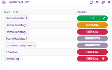
The Dashlet will display the name of the Hashtag and its status. This table can be sorted alphabetically or by Status severity, for example, CRITICAL, WARNING, UNKNOWN, or OK.
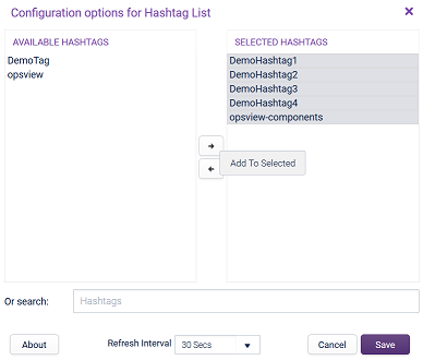
To configure this Dashlet, click on the cog icon in the Dashlet’s header. You can then choose which Hashtags you wish to display in this particular Dashlet:
Note
If no hashtags are specified, only the first 100 hashtags will be retrieved. If you configure a specific list of hashtags, there will be no limit.
Instead of selecting each hashtag one by one, you can use the Search box type in a string that will include every hashtag matching that string. This means that when you add a new hashtag that matches this Search string, the hashtag will be automatically included on this Dashlet.
Hashtag Cells Copied
This Dashlet provides a cut-down version of the Grid View found within the Hashtags section of Monitoring:
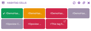
The Dashlet will display the description (if it exists) or else the name of each Hashtag in individual cells and the cell’s color will indicate the status of the Hashtag.
To configure this Dashlet, click on the cog icon in the Dashlet’s header. You can then choose which Hashtags you wish to display in this particular Dashlet:
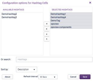
Note
If no hashtags are specified, only the first 100 hashtags will be retrieved. If you configure a specific list of hashtags, there will be no limit.
Instead of selecting each hashtag one by one, you can use the Search box type in a string that will include every hashtag matching that string. This means that when you add a new hashtag that matches this Search string, the hashtag will be automatically included on this Dashlet.
You can also define how the Dashlet should display by using the Sort by options.
Technical Dashlets Copied
These Dashlets are available in the second drawer called Technical under the Configuration area on the left-hand side.
Host Interfaces Copied
This dashlet displays the speed throughput, discards and errors information for each interface configured via the Host SNMP Tab. This contains the current information over the last polling interval, usually the last 5 minutes.
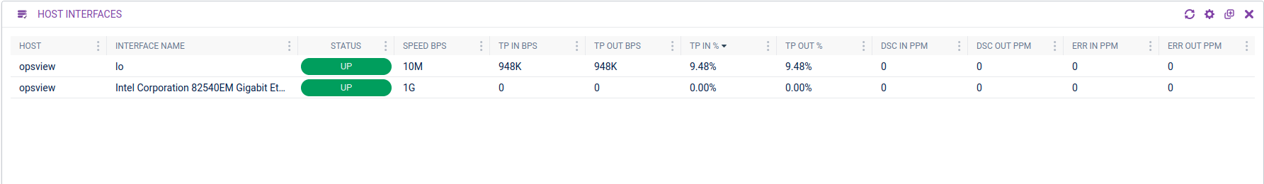
The interfaces that have never returned any performance data will not be included until it has had at least one metric returned, and interfaces with no detected speed will not be included either. Also, as this uses the status information and performance data of the latest service check result, if the latest check has failed, then the interface will not be listed.
Columns are:
- Host — name of Host.
- Host Group — name of Host Group that this Host belongs to.
- Network Address — network address for this Host.
- Host Description — description of this Host.
- Interface Name — name of interface.
- Status — based on the status of the
“Interface: NAME”Service Check. - Speed Bps — speed of the interface in bytes per second.
- TP In Bps — throughput inbound in bytes per second.
- TP Out Bps — throughput outbound in bytes per second.
- TP In % — throughput inbound in percent.
- TP Out % — throughput outbound in percent.
- Dsc In Ppm — number of inbound packets discarded per minute.
- Dsc Out Ppm — number of outbound packets discarded per minute.
- Err In Ppm — number of inbound packets marked as error per minute.
- Err Out Ppm — number of outbound packets marked as error per minute.
You can resize, sort, reorder, or hide any column.
To configure this Dashlet, click on the cog icon in the Dashlet’s header. You can filter which hosts are included via the host filter field (with support for a % wildcard), via the host group selection or via the hashtag selection.
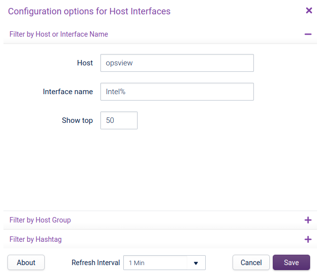
You can also filter by the interface name (with support for a % wildcard) and limit the number of rows returned.
A tooltip containing all the information about that interface will appear when you hover over a row.
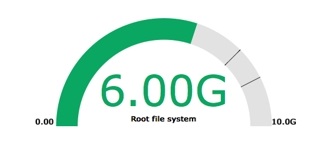
Performance Gauge Copied
This Dashlet is used to display one or more Service Checks in a gauge style, with the ability to show and threshold the WARNING and CRITICAL levels. Below is an example of a Performance Gauge used to measure available file system storage:
To configure this Dashlet, click on the cog icon in the Dashlet’s header.
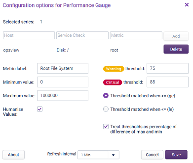
In the Dashlet we only have one series, 'Opsview::Disk: /::root' (Host::Service Check::Metric), however, you can use more than one and click the Add button to cumulate them in the same Dashlet.
The available fields to set a series are:
- Metric label — give the gauge a name.
- Minimum and maximum value — user set, for example, the left and right of the performance gauge, as is the
WARNINGandCRITICALthreshold fields. - Thresholds — define when the value is greater than
WARNINGorCRITICAL, or conversely you can have thresholds defined when the value returned is lesser thanWARNINGorCRITICAL(for example, space remaining). - Threshold matched when >= (ge) — if ticked, then the critical value must be higher than the warning value.
- Threshold matched when <= (ge) — if ticked, the warning value must be higher than the critical value.
- Treat thresholds as a percentage of difference between max and min — if ticked, the warning and critical values must be within 0 to 100%, otherwise they must be between the minimum and maximum values.
- Humanise Values — when ticked, the returned value will be modified and improved by Opsview Monitor. For example, Opsview Monitor will convert
6001Mbto6.0G, as below. Humanise values also converts the minimum and maximum values, meaning10000000000becomes10G(Gigabytes). Even with Humanise.. checked, the values need to be entered in a byte format:10000000000for10.0GB,10000000for10MB, and so forth.
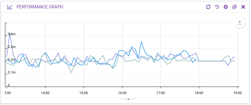
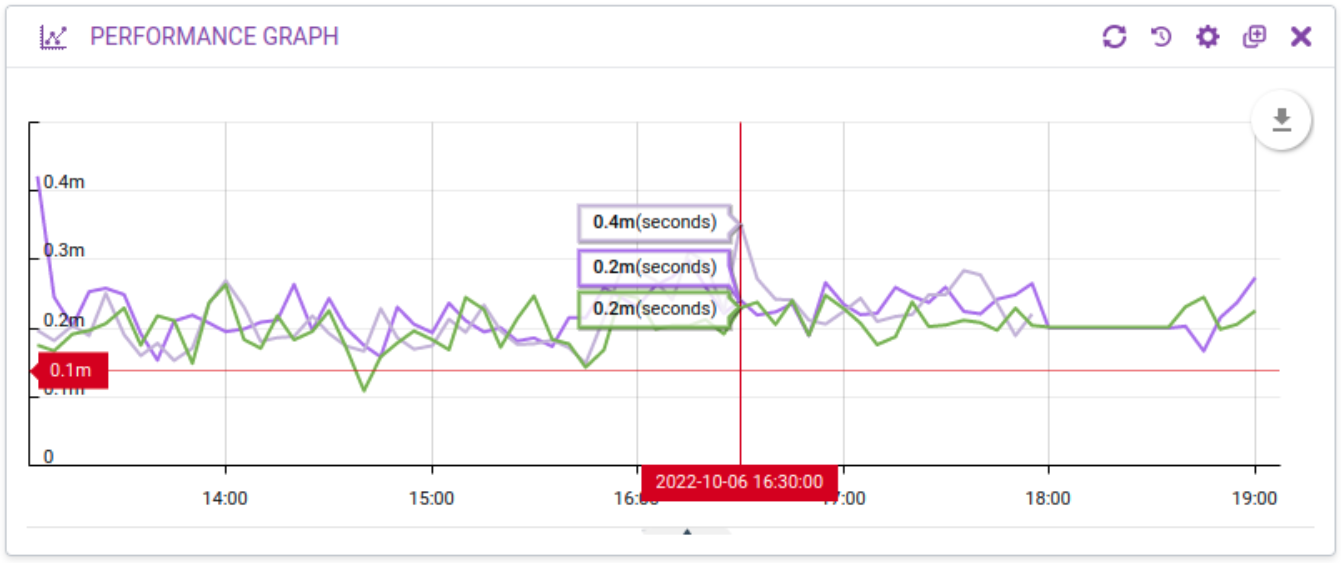
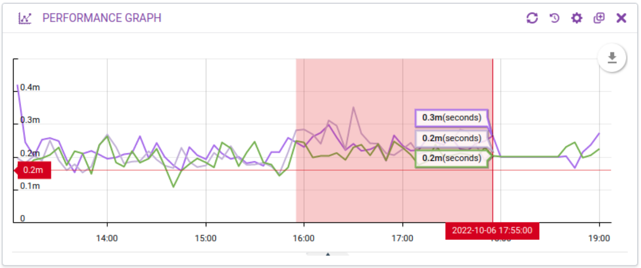
Performance Graph Copied
This Dashlet allows Users to add a graph to their Dashlet, in a similar view and format to that within the Graph Center and within the Investigate Mode in Host Groups, Hosts, and Services:
To configure this Dashlet, click on the cog icon in the Dashlet’s header.
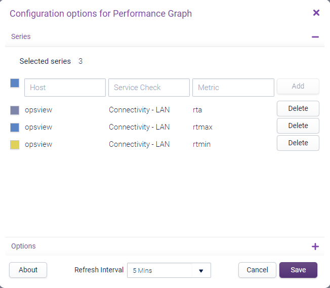
You can multi-select the Hosts, click Add and the combination will be added. A maximum of 30 series can be displayed on the graph at once.
The options section contains the following settings:
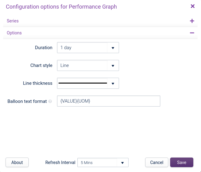
- Duration: — range of data the graph will show.
- Chart style: — display chart styles: Line, Area, or Stack.
- Line thickness: — thickness of the per-series lines which is used for all the styles.
Balloon Text Format Copied
You can customise the format of the balloon text when hovering over a graph line. Available macros are:
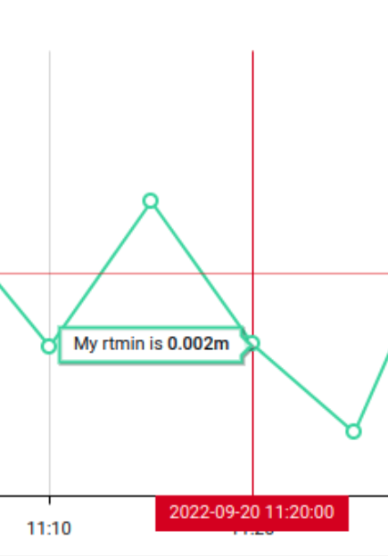
{HOST}— host name of the performance metric.{SERVICE}— service check name of the performance metric.{METRIC}— metric name of the performance metric.{VALUE}— humanised value of the graph line at the particular point in time. This will be in bold.{UOM}— unit of measurement returned by the performance metric. This will be either empty (if no uom) or with parenthesis around the uom.
For security, the following characters will be automatically stripped from the balloon text: <>&.
The data on the Performance Graph can be viewed by clicking on the up arrow, located at the bottom of the Performance Graph Dashlet:
![]()
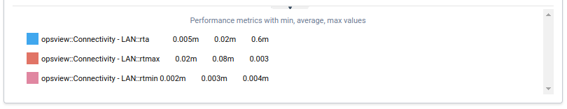
When this arrow is clicked, the drawer will load. This drawer contains the series data including hostname and Service Check:
You can hover over the cursor over the graph to get balloons that highlight what the metric values were at particular points in time and the legend will change to show the current value of the graph under the cursor. The balloons can be quite busy, so you can toggle it off by going to the circular graph menu in the top right and clicking Toggle balloon.
When you hover over a metric, all other metrics will be de-emphasised so you can concentrate of that particular line. If you click on a metric the graph line will be hidden. This is useful if you want to reduce the noise from that metric but still compare against multiple metrics.
You can adjust the height of the legend by dragging the bar at the top of the legend panel. You can close the panel by clicking on the close control in the middle of the bar.
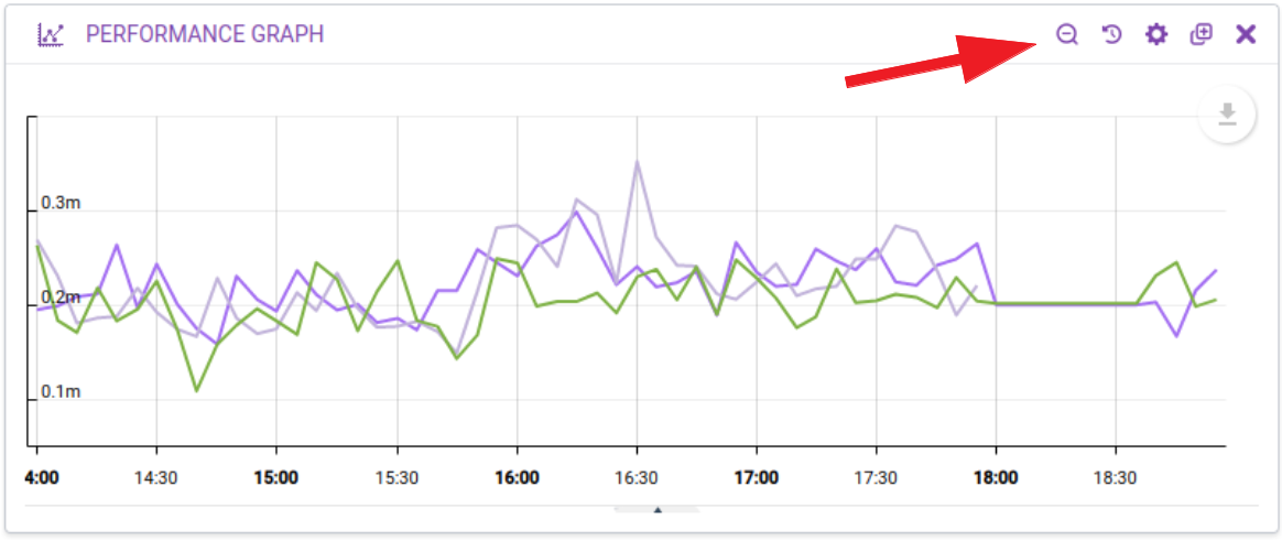
You can zoom into a graph by click and dragging within the graph.
You can zoom out using the tool that will appear in the Dashlet’s header.
Additionally, you can use the Time Range Picker to select a historical time range.
From the circular graph menu, you can:
- Toggle balloons — enable or disable the balloons over each value.
- Download as — download the graph as an image, either PNG, JPG, SVG or PDF. Downloading the graph will include the legend and the min, average, and max values.
- Save as — save the graph data as a CSV, XLS or JSON format.
- Annotate — draw on top of the graph any annotations you want.
Network Map Copied
This Dashlet allows you to see the hierarchy of the Hosts within your environment by showing the dependencies between Hosts (as defined by the administrator), and draws a spider diagram outlining the relationship between Hosts, along with a status indicator for each Host:
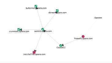
In the example above, we have focused the network map on the Host firewall1. This Host is connected to a router, Cisco2611, which subsequently connects to a switch3 which has four Hosts connected to it.
You can do the following:
- Move the map by clicking and dragging with the mouse, as well as zoom in and out using the scroll wheel.
- Re-position hosts inside the map by directly clicking and dragging them where you want.
- Click a specific host to enlarge the icon and highlight its relevant parent or child relationship arrows
- Click the hostname displayed beneath the icon to get to the Navigator page with that host selected.
To configure this Dashlet, click on the cog icon in the Dashlet’s header.
The Filter by Host group section allows you to filter the list of Hosts available within the Filter from Host by a given Host Group, and also limits the network map Dashlet to only show Hosts that are within the specified Host Group.
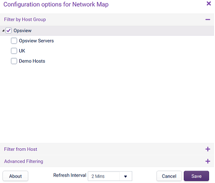
The Filter from Host section allows you to select a Host of which you wish to see the expanded network map:
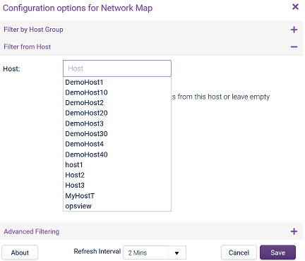
The Advanced filtering section offers further display options:
- Only display Hosts that possess one or more children: removes the status from Hosts who have no further children. With this option checked, the status (green/red/yellow) is hidden. If this option is unchecked, it displays the Host status.
- Delete Saved positions: resets the network map on each load if you have dragged them into different positions.
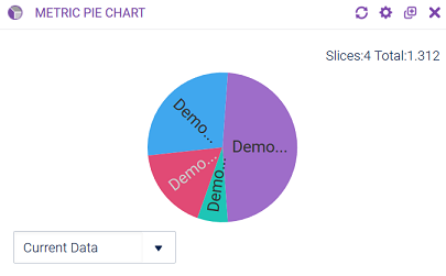
Metric Pie Chart Copied
This Dashlet allows you to create a pie chart view of the performance data gathered within Opsview Monitor for Service Checks metrics. For example, you can compare which Hosts are using the most network bandwidth, and which Hosts are using the most disk space.
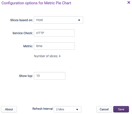
To configure this Dashlet, click on the cog icon in the Dashlet’s header:
The pie chart segments can be hovered over, which will display a tooltip containing the Host, Service Check, metric and value fields, along with the percentage of the pie chart that slice has, and a small sparkline graph displaying historical performance over the last month:
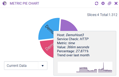
A legend icon in the top left-hand side allows you to view a legend for any slices too small to have individual labels on the pie chart. You can also enable/disable them by clicking on them via this list to focus on the larger segments.
The Current Data drop-down in the bottom left allows you to view older data in the pie chart (if available).
The data in the top right hand side will list the number of slices, and also the total data. If each slice is Number of connections, then the number will be total number of connections across all slices.
You can enter wildcards (%) in the Host, Service Check, and Metric fields to match multiple performance metrics.
Host Group List Copied
This Dashlet provides a cut-down version of the view available the Navigator page. It allows you to view the Downtime, Host Handled, Host Unhandled, Service Handled, Service Handled, Total Hosts, and Total Service Checks columns on a per Host Group basis.
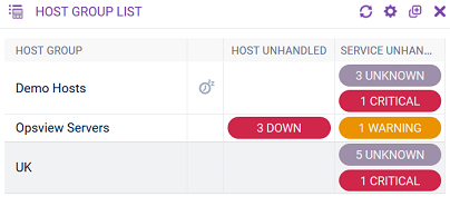
By default, only three status columns are displayed: Downtime, Host Unhandled, and Service Unhandled, and all Host groups are shown.
To add or remove columns, hold the mouse cursor over the column header row, click on the contextual menu icon that appears and then select or deselect column names within the Edit Columns menu:
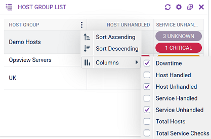
The Host Group List can be sorted by clicking on the column name, or via the contextual menu icon for that column header.
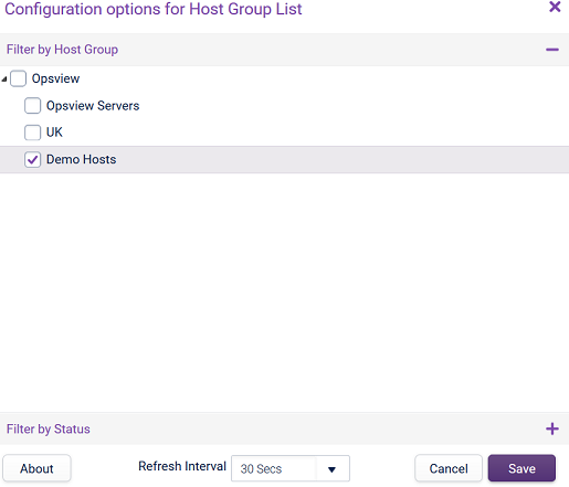
To configure this Dashlet, click on the cog icon in the Dashlet’s header.
- Filter by Host group: this filter the Dashlet to only display selected Host groups.
- Filter by State: this filter the Dashlet to display only Hosts or Service Checks in a certain state.
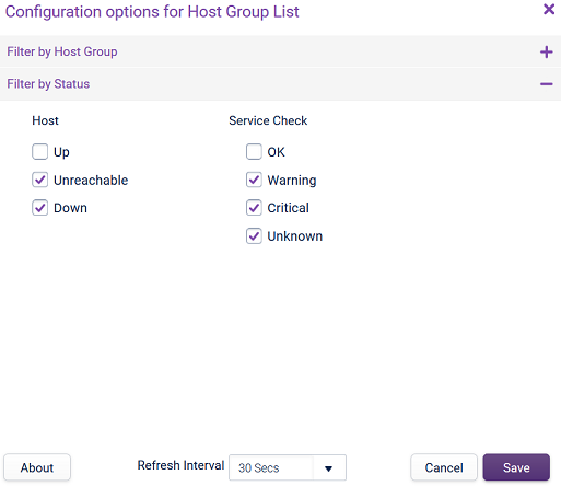
You must select at least one Host Check state and one Service Check state, as this dashlet uses the intersection of the filters. For example, selecting DOWN and OK will only show DOWN hosts and then only display the OK service checks on those hosts. If you specify a leaf host group, will show just that host group. Otherwise, will show all the host groups one level below the chosen host group.
Host Group Tree Map Copied
This Dashlet displays a visual representation of the health of the Service Checks within one or more Host Groups within Opsview Monitor:
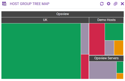
The size of the cell is proportional to the number of Service Checks within the given Hashtag in a certain state. To configure this Dashlet, click on the cog icon in the Dashlet’s header. You can then choose which Host Groups you wish to display in this particular Dashlet:

You can also choose to Filter by Status, which allows you to tell the Host Group Tree Map to only display Hosts or Service Checks that are in a certain state, for example, OK, CRITICAL, and UP.
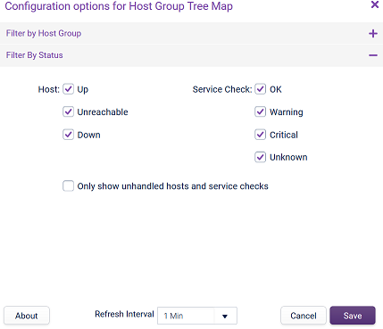
You can choose to Only show unhandled hosts and service checks, which will only display Hosts or Service Checks that are in an unhandled state, for example, CRITICAL, WARNING, and UNKNOWN, or DOWN and UNREACHABLE, and not acknowledged by an administrator.
Event Table Copied
This Dashlet allows you to view the status changes in a table smaller version than the table within the Events Viewer page:
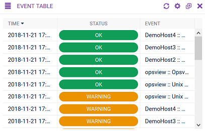
The most recent events are at the top. To configure this Dashlet, click on the cog icon in the Dashlet’s header:
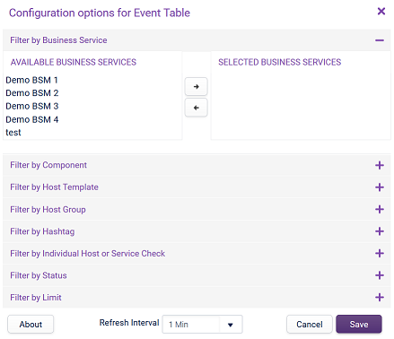
You can choose to filter the Events Table to show events that have occurred within specific:
- Business Services
- Business Components
- Host Templates
- Host Groups
- Hashtags
- Hosts or Service Checks
- Filter by events based on their status
These filters are applied using an AND logic, for example:
‘Only show events within ‘Host Group A’, on Hosts ‘B’ and ‘C’, only within the Host Template ‘Unix Base’, and only show CRITICAL events, that are in a HARD state’.
In Filter by Limit, you can choose to restrict the number of events shown in the table via the Filter by Limit drawer, which allows to display the 25, 50, 100, or 250 most recent events.
Event Graph Copied
This Dashlet allows you to view the status changes in a graph smaller version than the table within the Events Viewer page:
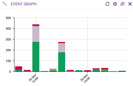
To see what the events are, click on a colored section. This displays the data in a table:
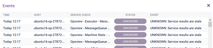
You can display additional columns, and when you hover over a row, a tooltip containing all the information about that event will appear.
Unlike in the main Event Viewer section within Monitoring, only one bar can be selected at a time.
To configure this Dashlet, click on the cog icon in the Dashlet’s header:
You can choose to filter the Events Table to show events that have occurred within specific:
- Business Services
- Business Components
- Host Templates
- Host Groups
- Hashtags
- Hosts or Service Checks
- Filter by events based on their status
These filters are applied using an ‘AND’ logic, for example:
‘Only show events within ‘Host Group A’, on Hosts ‘B’ and ‘C’, only within the Host Template ‘Unix Base’, and only show CRITICAL events, that are in a HARD state’.
In Filter by Limit, you can choose to restrict the number of events shown in the table via the Filter by Limit drawer, which allows to display the 25, 50, 100, or 250 most recent events.
Top Service Issues Copied
This Dashlet allows you to choose a Service Check and view all of the Hosts that have that Service Check, in a problem state (WARNING or CRITICAL):
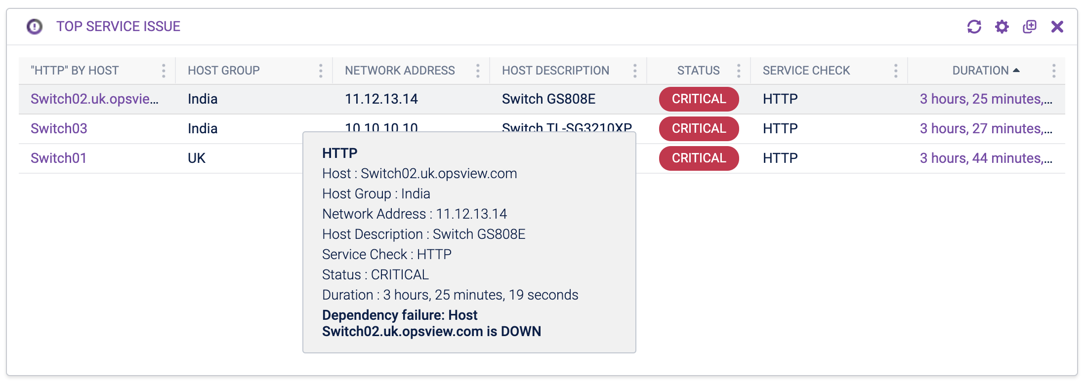
The columns are:
- Host Name (SERVICENAME by Host) — name of the Host with at least one Service Check in a problem state.
- Host Group — name of the Host Group that the Host belongs to.
- Network Address — network address of the Host.
- Host Description — freeform description of the Host.
- Service Check — name of the Service Check on the Host. For a summarized row when using wildcards, this is the Service Check with the worst state and longest duration on that Host.
- Status — status of the most problematic Service Check.
- Duration — length of time this Service Check has been in this state.
Data is sorted by shortest to longest duration.
Hover over a row to get more information about the Host.
You can click on a row to open a window to Navigator for this particular Host, to investigate further.
The row will change background color if the duration is greater than the configured duration.
Columns are re-orderable, re-sizeable and hideable.
To configure this Dashlet, click on the cog icon in the Dashlet’s header:
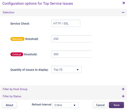
In the configuration window, you can choose which service check to look into, with support for wildcards (%) to match multiple Services.
You can determine a warning or critical duration threshold (in days), which will change the color of the row depending on how long that Service Check has been in a problem state.
You can also choose to define the quantity of issues to display, either top 10 or top 25.
Note
If multiple Services are picked up for the same Host (via use of a wildcard) then the dashlet will summarize the number of critical Services (or warning Services, if no critical Services are present) in the ‘Status’ column, with either the current number up to 9, or “9+”. The ‘Duration’ column (used for sorting) and tooltip will then refer to the single Service with the most severe state and the longest duration in that state.
Note that the total number of Services summarized on a row may be less than the total number of problem state Services on the respective Host, if more than 25 problem state Services are detected by the dashlet overall. In these cases, these will still be the issues with the longest duration, on that Host.
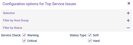
There are also options to further filter the list, for example, only show Hosts that have a specific Service Check in a problem state, within a certain Host Group (Filter by Host group), or within a certain Hashtag (Filter by Hashtag), or if the Service Check is in a particular state type (Filter by State).
Top Services by Metric Copied
The Top Services by Metric dashlet is different from the Top Service Issues dashlet where it allows you to choose not only a Service Check, but also a metric of the Service Check.
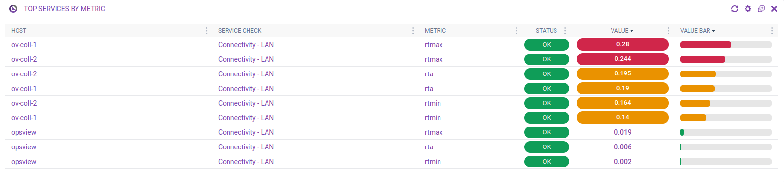
The other difference is that it lists all Hosts who have the specified Service Check and metric, instead of only ones who have the given Service Check in a non-OK state.
Note
If a metric has no value in it, it will be displayed asNonein the Value column. The Value Bar is available to display values in a visual format.
To configure this Dashlet, click on the ‘cog’ icon in the Dashlet’s header:
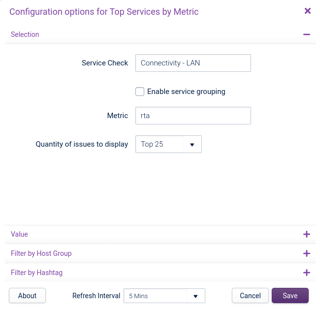
You can select the Service Check name and Metric name, with support for wildcards (%) to match multiple services or performance metrics.
Ticking Enable service grouping will collapse checks that are repeated per Variable, such as Disk Checks, into a single Service Check within this dashlet.
You can also choose to define the Quantity of issues to display, either Top 10, or Top 25. Select the Value section to see additional options.
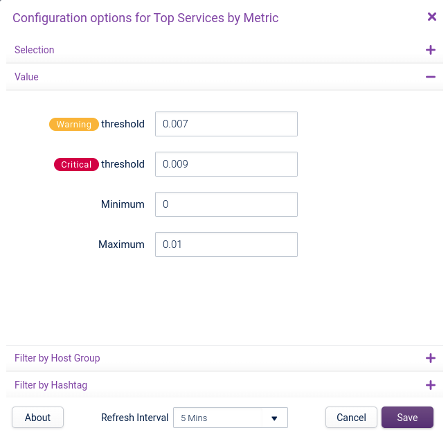
Set the minimum and maximum expected values for the Value Bar bars here, as well as the warning and critical thresholds to use for coloring the Value pills and Value Bar bars. The default minimum and maximum values used in the dashlet will be 0 and 100 respectively, if none are configured.
You can also filter by hashtags and host groups. All columns are resizeable, hideable, and reorderable.
Note
This is not saved if you are using a shared dashboard.
Extra columns that can be revealed:
- Host Group — display the Host Group that the Host belongs to.
- Network Address — display the Host IP address.
- Host Description — display the Host description.
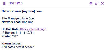
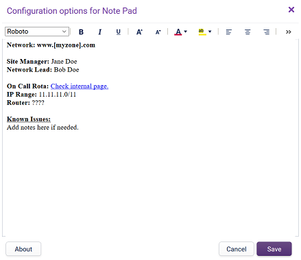
Note Pad Copied
This Dashlet allows you to add text via a WYSIWYG editor, allowing you to add text, notes, hyperlinks, contact phone numbers and more to a Dashboard.
To get to the WYSIWYG editor, click on the ‘cog’ icon in the Dashlet’s header:
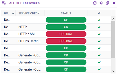
All Host Services Copied
This Dashlet allows seeing an overview of Service Checks, as if you had selected a host in the Navigator page, as well as Host Checks.
Note
Host Check rows will not have a value inside the ‘Service Check’ column, and therefore will always be sorted before them alphabetically.
The columns are:
- Host — name of the Host.
- Host Group — name of the Host Group that the Host belongs to.
- Network Address — network address of the Host.
- Host Description — freeform description of the Host.
- Host Downtime — display an icon if the Host is in downtime.
- Service Check — name of the Service Check. This will be empty if the row is a Host object.
- Service Downtime — display an icon if the Service Check is in downtime.
- Status — status of the Host or Service Check.
- ✔️ — denotes the handled state of the Host or Service Check.
- State Type — soft or hard state of the Host or Service Check.
- Number # — check number.
- Last Check — time when the last check was.
- Duration — length of time this Host or Service Check has been in this state.
- Status Info — output of the plugin.
Data is sortable by most columns. Most columns can be resized, reordered, and hidden.
A tooltip containing all the information about that Host or Service Check will appear when you hover over a row.
To configure this Dashlet, click on the cog icon in the Dashlet’s header:
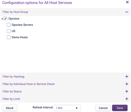
You can choose to filter the table by:
- Host Groups
- Hashtags
- Host or Service Check
- Status
The Filter by Limit section allows you to choose whether the Dashlet displays only Host Checks, Service Checks or both, and how many items to display. When sorting the table, this limit is applied after the sorting. Therefore, if there are 100 items and you display the Top 10 sorting in an ascending or descending order will show the first or last 10 items of the hundred, respectively.
Flow Collectors Dashlets Copied
If you have enabled the Flow Collectors functionality, some additional Flow Collector Dashlets are enabled.
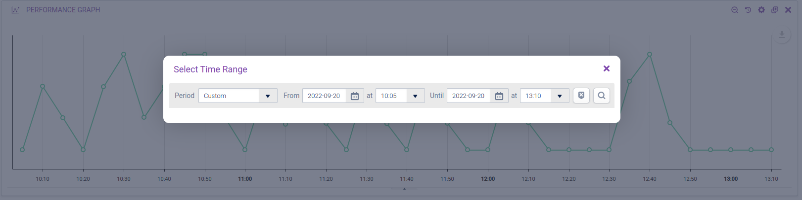
Dashlet Time Range Picker Copied
Some dashlets feature a Time Range icon in the toolbar:
![]()
If clicked, a modal will open allowing a time range to be selected. This will stop the dashlet refreshing and redraw the data to match the requested time range.
Supported dashlets:
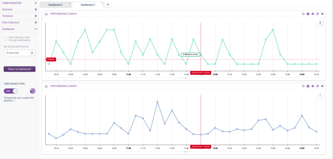
Dashlet Time Range Sync Copied
When you toggle on Time Range Sync in the Dashboard configuration:
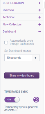
Some dashlets will go into a sync mode. This allows you to make time range changes on one dashlet that will apply to all, to easily compare data over time.
Supported dashlets:
- Performance Graph (will synchronize with other Performance Graph dashlets only)
- Receivers Protocol Trend (will synchronize with other Receivers Protocol Trend and Transmitters Protocol Trend dashlets only)
- Transmitters Protocol Trend (will synchronize with other Receivers Protocol Trend and Transmitters Protocol Trend dashlets only)
This mode is visually represented by the Time Range Icon in the dashlet toolbars being inverted.
| Icon | Description |
|---|---|
| Not synchronized | |
| Synchronized |
While in this mode:
- When you select a time range (via the Time Range Window or via mouse selection) then all graphs will use the same time range, and cursors will be synchronized.
- If you click zoom out, then each dashlet will revert to its configured duration, cursor syncing will stop and refresh as normal.
- If you change a synchronized dashlet’s duration configuration, the change will be saved but the view will not be updated.
Take note of the following:
- The actions in the refresh button menu are not synchronized.
- If you quickly select new time ranges while the dashlets are loading the previous time range, the graphs may get out of sync. Using the Time Range Window will resolve this.
When you toggle sync mode off, any changes applied to dashlets will be applied individually as normal.
This mode is temporary, so if the Dashboard page is reloaded in the browser, the sync mode will be turned off.