Available reports
This document lists all the standard report types currently available in Capacity Planner along with their description and examples. Each report includes parameters to add flexibility. These allow you to select and filter data of interest and to choose output formats. For more details see, Report parameters.
If you require a custom report to be added to your project, please contact your Capacity Planner representative.
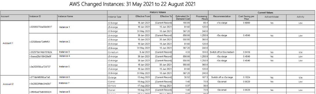
AWS changed instances Copied
This report lists all EC2 instances that have changed instance type within the time frame of the selected baseline. The Historic Values section of the report displays the instance type changes, effective dates, and estimated on-demand costs. The Current Values section displays current values of right-sizing recommendations, cost saving, and values of properties selected via the Grouping Values to Display prompt.
Report parameters Copied
Below are the parameters used to configure this report. For information on parameters that are common across reports, such as entities or grouping filters, see Report parameters.
- Grouping Values to Display — the report allows selection of multiple instance properties to display alongside the recommendations.
Example Copied
In the image below, you can see an example of an output of this report.
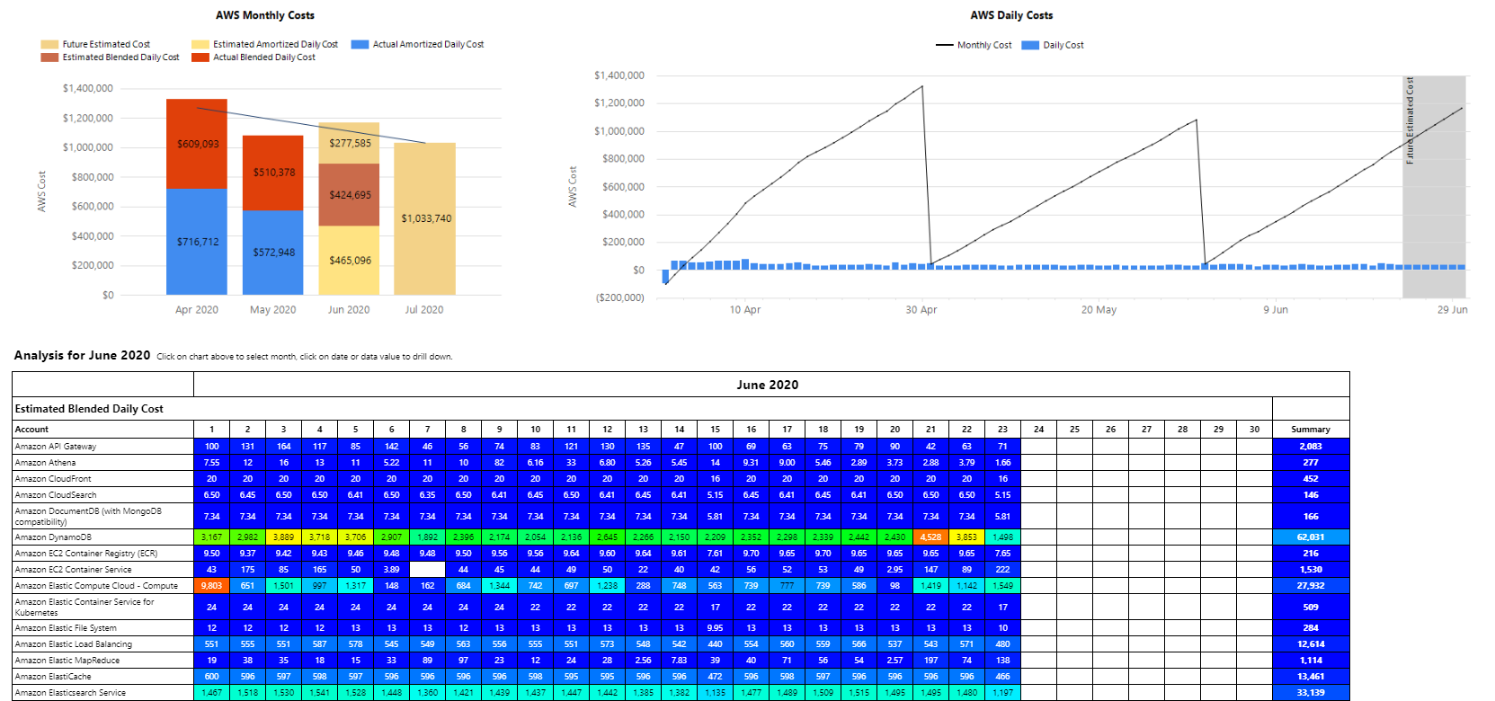
AWS cost analysis report Copied
This report allows you look into what is happening in your estate in different periods of time. It is an alternative to the timeburst for analysis of daily list costs.
The report includes the following information:
- You can break down information by tags.
- You can look at when machines have been idle, and how much it was costing you.
- Forecast based on current spend.
- The amount of money spent for a particular product on a particular day.
For more information on configuring cloud cost optimisation recommendations, see Recommendations for cloud environments.
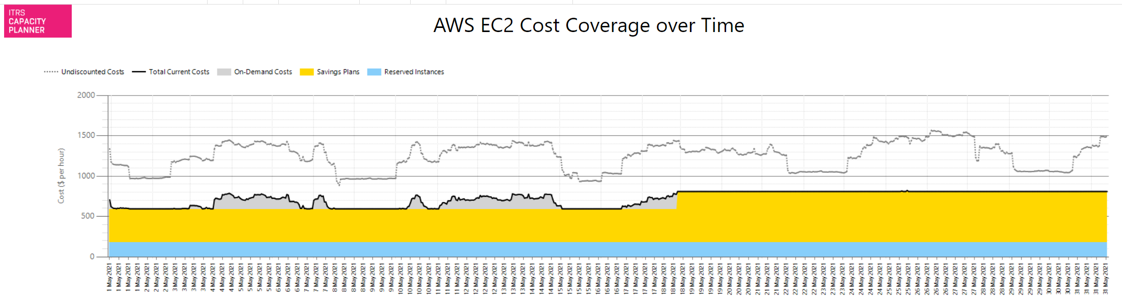
AWS EC2 cost coverage over time report Copied
This report provides a comprehensive combined view of your EC2 running costs and insight into how effective current saving mechanisms are.
In an AWS environment there are up to four time series displayed:
- Undiscounted costs — this represents the pure costs of your EC2 compute environment if no discounts were applied. It is using provider reference data on hourly instance costs.
- Total current costs — this time series represents the actual costs when considering discounts applied as a result of reservations and savings plans investments (AWS only). The grey area represents the amount of expenditure on pure on-demand costs. Any instances not covered by reservations or savings plans will be incurring provider reference costs (or custom costs based on an Enterprise Discount Plan).
- Savings Plans — the yellow area shows the amount of costs that are covered by savings plans.
- Reserved Instances — the blue area shows the amount of costs that are covered by reservations.
Example Copied
In the image below, you can see an example of an output of this report.
This example shows an environment that has been saving substantially over the costs of pure on-demand.
On 18 May 2021, the organisation increased their investment in Savings Plans. From that point onwards, there are no on-demand costs at all. The combination of reservations and savings plans is such that no instances are incurring the on-demand costs.
It is likely that the purchase on 18 May was higher than required. Given that there is no on-demand costs at all from that point on, there are no further opportunities for short term savings using right-sizing or switching off idle instances. The reason for this is that the savings plans and reservations costs are committed.
We recommend that right-sizing and idle machine management is carried out. This will help reduce new on-demand costs, optimise the existing investments and avoid the need to purchase further savings plans or reservations.
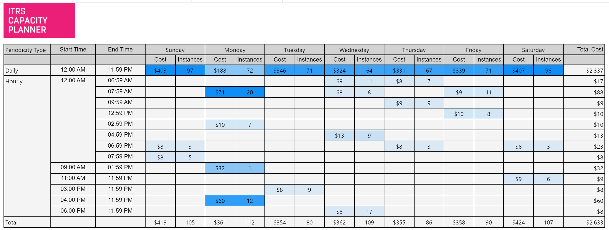
AWS EC2 instance periodicity report Copied
This report analyses the activity of a selected group of instances and determines the time intervals when those instances are reliably inactive during the selected time frame. The recommendation action is that automation can be used to switch identified machines on and off at these times to save cloud costs.
By default, the selected time frame covers the entire baseline duration but this can be configured. It is recommended that you run this report over as long a time period as possible to ensure accuracy.
Report parameters Copied
Below are the parameters used to configure this report. For information on parameters that are common across reports, such as entities or grouping filters, see Report parameters.
The primary configuration parameters are:
- Idle CPU Threshold % — the CPU limit below which the instance can be considered idle.
- Runtime % >= — the minimum time an instance has been running over the chosen date range. It is recommended that you do not reduce this from 90%.
- Top ‘N’ Periods — limit the report to consider the top ‘N’ most valuable time periods. Increasing this will increase the number of reported time periods.
The minimum time period considered in this report is an hour.
Example Copied
In the image below, you can see an example of an output of this report.
This example shows that on a Sunday, between 3:00 AM and 7:59 PM, 6 machines are reliably idle. That is, they are long- running instances and they have been constantly below 5% CPU utilisation during those times.
This report provides the following information:
-
The type of identified periodicity can be Daily or Hourly:
- Daily indicates that machines highlighted on this row demonstrate reliable periodicity for the entire day. This would indicate that these machines were reliably idle for an entire day.
- Any machines highlighted on the hourly row are those that demonstrate reliable periodic idles in that time window.
-
Start Time — indicates the start of the time window of reliable periodic idle times.
-
End Time — indicates the end of the time window of reliable periodic idle times.
-
Cost — the on-demand expenditure of the instances identified during that time window.
-
Instances — the number of machines idle during that time window.
-
Total Cost — the total on-demand expenditure of machines running when idle.
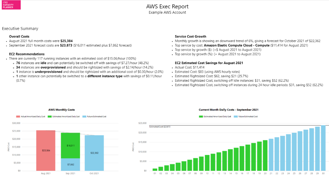
AWS exec report Copied
This report displays a summary of costs and cost trends, service growth, instance recommendations and potential savings.
Report parameters Copied
Below are the parameters used to configure this report. For information on parameters that are common across reports, such as entities or grouping filters, see Report parameters.
- AWS account — select which of your AWS accounts should be included in the report.
- Daily cost metric — allows selection of cost metric, for example, Amortized or Blended.
- Previous months to include — indicate how many months you want to include in the report.
- VM grouping — select which VM groupings to use in the report.
For more information on configuring cloud cost optimisation recommendations, see Recommendations for cloud environments.
AWS recommendations Copied
This report displays a list of EC2 instances with right-sizing recommendations across your estate along with potential savings based on these recommendations. Only instances where a change is recommended (for example, of instance type or location) are shown.
For more information on how to configure recommendations, see Configure cloud recommendations.
Report parameters Copied
Below are the parameters used to configure this report. For information on parameters that are common across reports, such as entities or grouping filters, see Report parameters.
- AWS account — select which of your AWS accounts should be included in the report.
- Report Sections to Include — this report is divided into three sections: Recommendations, Baseline summaries, and Daily boxplots. You can decide which sections to display.
Note that if you select more than one section, they are displayed one after another so depending on how much data your report displays, you may need to move through the report pages to see the next section. When exported to Excel, the three sections are displayed in separate worksheets.
- State — allows filtering of instances by VM state.
- Include all idle instances — idle instances with right-sizing recommendations are always included by default. Select this option to also include all other idle instances, allowing you to view potential savings if these are switched off.
- Exclude ignore list instances — you can include or exclude all instances that you added to the ignore list. For more information, see Ignored instances.
Example Copied
In the image below, you can see an example of an output of this report.
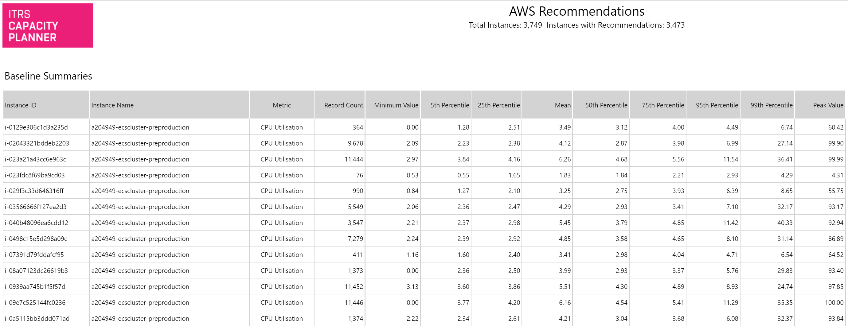
The default sorting can be changed by clicking the arrows above each column to sort by that column.
Azure changed instances Copied
This report lists all Azure VMs that have changed VM type within the time frame of the selected baseline. The Historic Values section of the report displays the VM type changes, effective dates and estimated on-demand costs. The Current Values section displays current values of right-sizing recommendations, cost saving, and values of properties selected via the Grouping Values to Display prompt.
Report parameters Copied
Below are the parameters used to configure this report. For information on parameters that are common across reports, such as entities or grouping filters, see Report parameters.
- Grouping Values to Display — the report allows selection of multiple VM properties to display alongside the recommendations.
Azure exec report Copied
This report displays a summary of costs and cost trends, service growth, instance recommendations, and potential savings.
Report parameters Copied
Below are the parameters used to configure this report. For information on parameters that are common across reports, such as entities or grouping filters, see Report parameters.
- Azure subscription — select which of your Azure subscriptions should be included in the report.
- Daily cost metric — allows selection of cost metric, for example, Amortized or Blended.
- Previous months to include — indicate the number of months you want to include in the report.
- VM grouping — select which VM groupings to use in the report.
Azure recommendations Copied
This report displays a list of Azure VMs with right-sizing recommendations across your estate along with potential savings based on these recommendations. Only VMs where a change is recommended are shown.
For more information on how to configure recommendations, see Configure cloud recommendations.
Report parameters Copied
Below are the parameters used to configure this report. For information on parameters that are common across reports, such as entities or grouping filters, see Report parameters.
- Azure subscription — select which of your Azure subscriptions should be included in the report.
- Report Sections to Include — this report is divided into three sections: Recommendations, Baseline summaries, and Daily boxplots. You can decide which sections to display.
Note that if you select more than one section, they are displayed one after another so depending on how much data your report displays, you may need to move through the report pages to see the next section. When exported to Excel, the three sections are displayed in separate worksheets.
- Powerstate — allows filtering of instances by Azure powerstate.
- Include all idle instances — idle instances with right-sizing recommendations are always included by default. Select this option to also include all other idle instances, allowing you to view potential savings if these are switched off.
- Exclude ignore list instances — you can include or exclude all VMs that you added to the ignore list. For more information, see Ignored instances.
Example Copied
In the image below, you can see an example of an output of this report.
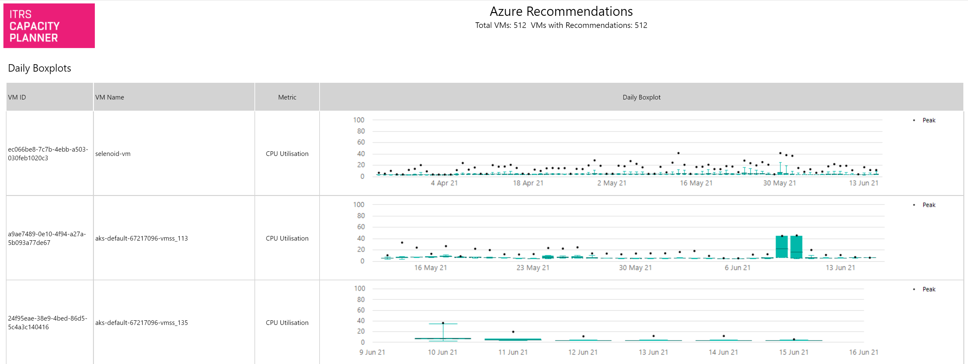
The default sorting can be changed by clicking the arrows above each column to sort by that column.
Azure VM periodicity Copied
This report identifies regular idle periods of Azure VMs on a daily and weekly basis and indicates potential savings to be made if the VMs are stopped during the indicated periods.
Report parameters Copied
Below are the parameters used to configure this report. For information on parameters that are common across reports, such as entities or grouping filters, see Report parameters.
- Idle CPU Threshold % — the CPU limit below which the machine can be considered idle.
- Runtime % >= — the minimum time a machine has been running over the chosen date range. It is recommended that you do not reduce this from 90%.
- Top ‘N’ Periods — limit the report to consider the top ‘N’ most valuable time periods. Increasing this will increase the number of reported time periods.
Example Copied
In the image below, you can see an example of an output of this report.
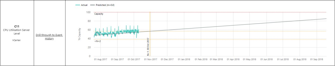
Cluster events Copied
This report displays all current projected cluster capacity events and the time series for these events. It also provides information on how often this cluster event has been raised and at which severity. You can view the history of each event using the Drill through to Event History option which takes you to the Cluster event history report.
Example Copied
In the image below, you can see an example of an output of this report.
This example shows increasing CPU over time. If this trend continues, the cluster will soon have less than one redundant server available.
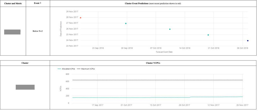
Cluster event history Copied
This report shows the event history for each cluster:
- Blue indicator marks the expected saturation date when the event was first raised.
- Red indicator marks the most recently calculated saturation date.
- A series of indicators show each date between the first and the most recent saturation date.
This can be used to gain an understanding of whether an event is coming closer and more imminent, or moving further into the future as a result of a flattening trend.
A chart is also provided showing the time series of allocated vCPUs in the cluster, giving an indication of growth that may also contribute to changes in the cluster saturation dates.
Example Copied
In the image below, you can see an example of an output of this report.
This example shows a cluster event that has been raised a number of times. When first raised, the projected saturation date was 29 October 2018. The most recent saturation date predicted is now 18 September as indicated by the red indicator on the chart.
The lower chart shows a time series trend of allocated vCPUs in this cluster. There has been a rise over the course of the last 3 months which is most likely leading to the change in projected saturation date for the cluster.
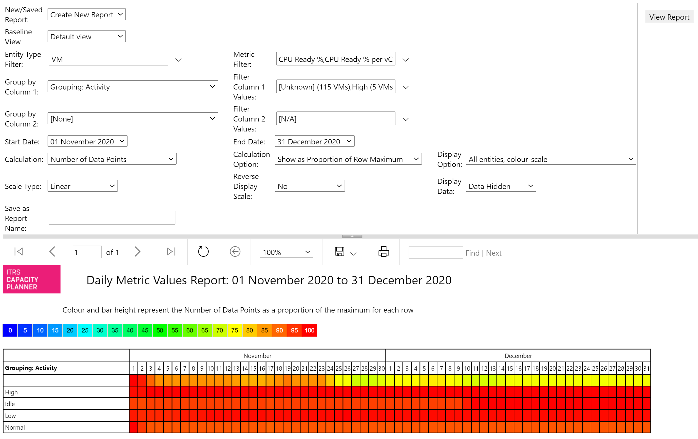
Daily metric values Copied
This report displays a heat map of the daily data coverage or daily metric values for a specific date range and set of metrics.
Report parameters Copied
Below are the parameters used to configure this report. For information on parameters that are common across reports, such as entities or grouping filters, see Report parameters.
- Entity type filter — the report can be run on one or more of the available entity types.
- Metric filter — allows selection of one or more metrics.
- Group by column — the data can be grouped by entity type, entity name, metric name or property value.
- Filter column values — if data is grouped by property value, a filter can be added to the report restricting the values listed.
- Start date / End date — allows selection of the range of dates to be included in the report.
- Calculation — the heatmap can represent the number of data points, number of entities supplying data or a daily metric value percentile.
- Calculation option — the colour scale or greyscale of each cell can either represent a proportion of the row maximum value or proportion of the report value.
- Display option — the heatmap can be shown in colour or as a greyscale. In addition, entities can be restricted to only those with full data coverage of the selected date range.
- Scale type — you can choose between linear and logarithmic scale.
- Reverse display scale — this option reverses the colour scale or greyscale.
- Display data — data values on each cell can be displayed or hidden.
Example Copied
In the image below, you can see an example of an output of this report.
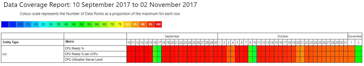
Data coverage Copied
This report allows you to monitor the volume of data received each day by Capacity Planner across different entity types and metrics.
You can select one or more entity types, and one or more metrics at minimum. The results can be shown at different summary levels, with the ability to group the results by the following:
- Entity type
- Entity name
- Metric name
- Grouping values
Report parameters Copied
Below are the parameters used to configure this report. For information on parameters that are common across reports, such as entities or grouping filters, see Report parameters.
Coverage is shown in a daily matrix report, with the following options available:
- Calculation — the report can show either number of data points received for each day, or the number of entities supplying data for a given date range that you selected.
- Display option:
- The report can display either all entities, or entities with incomplete coverage.
Incomplete coverage means that Capacity Planner received fewer data points than expected, or that there are gaps in data due to an issue in the system. - You can select between full colour and greyscale.
- The report can display either all entities, or entities with incomplete coverage.
- Calculation option — as a proportion of the row maximum or as a proportion of the report maximum.
- Scale type — can be linear or logarithmic.
- Display Data — you can display or hide detailed data from the report. If you are only interested in observing the colour variations rather than the absolute numbers, select Data Hidden.
Example Copied
In the image below, you can see an example of an output of this report.
Metric analysis — multi-chart Copied
This report allows you to create box plots, bar charts, line charts, and radar charts as well as linear trend charts and scatter plots with linear regression calculations. The report can be run using single or multiple metrics on groups of entities at any aggregation level available within Capacity Planner.
It displays a separate chart for each time-series in the report. If you want to display all entities on the same chart, use the Metric analysis — single-chart report.
An additional feature allows you to enter your own RAG (Red, Amber, Green) threshold values and display and sort by them. If no threshold operators are selected, the RAG status column is hidden and RAG threshold lines and status column do not appear on the report.
The Linear Trend and Scatter Plots calculate linear regression lines and associated intercept, gradient, and R2 values. Reports can be filtered and ordered by R2 values to allow the most significant ones to be identified. In these reports red and amber threshold values are used to calculate values on the best fit line allowing projected dates and values to be displayed. For example, in the Linear Trend report, the report display shows the projected dates at which amber and red threshold values would be reached.
Available chart types are:
- Box plot — this chart can be used for daily summaries and above (day, week, month etc.). It shows percentile values as a box with whiskers above and below to indicate the range of value distribution. This is the only chart type that can show more than one percentile value. However, the Percentile/Value selector still controls the metric used for RAG thresholds.
- Bar chart — values are shown as vertical bars.
- Line chart — values are plotted as points on a line.
- Linear trend — this chart plots metric values and linear regression line for any given metric. This chart should be used with hourly average or unaggregated data for shorter term trends. Longer term trends can make use of daily summary values.
- Radar chart — this chart plots all entities on a single radar visualization. This chart works well for comparing metrics but we recommend to use it with a relatively small number of entities to improve readability.
- Scatter plot (metric pairs) and scatter plot (metric pairs reversed) — these chart types appear in the drop-down list if two metrics are selected. They calculate linear regression lines based on metric pair values. Switching between these two report types reverses the X and Y axes of the report. Red and Amber threshold values calculate X axis values from the given Y axis values based on the regression line.
- Stacked bar chart — this chart presents a single bar per date showing the relative metric values.
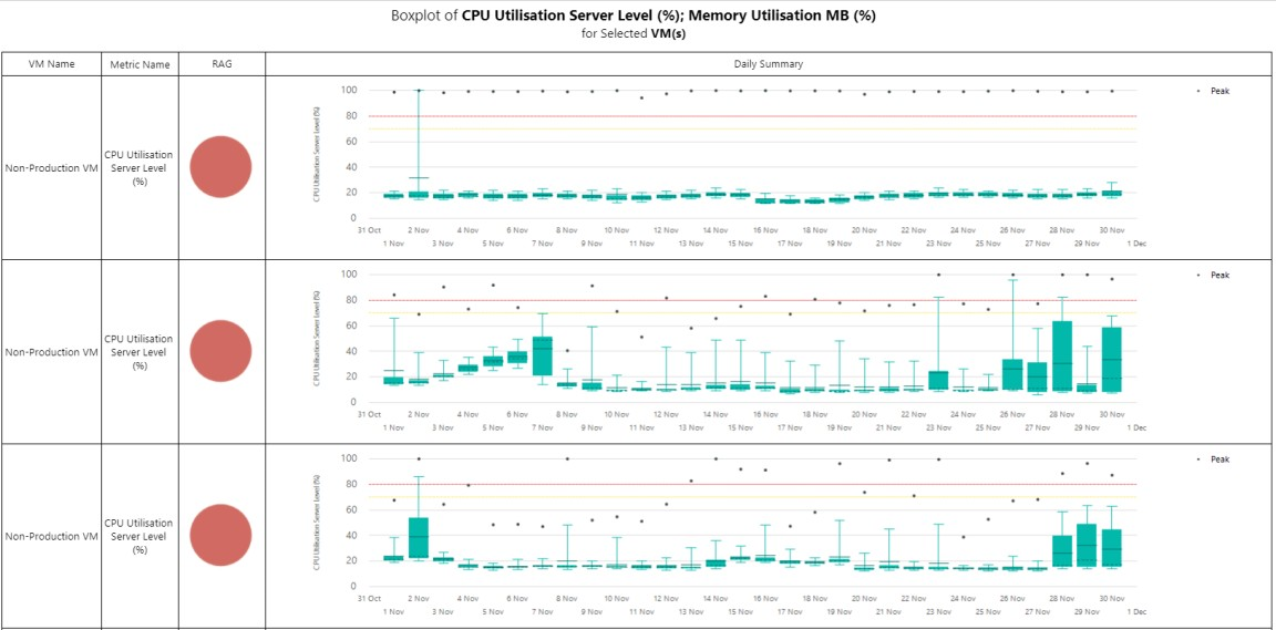
Example Copied
In the image below, you can see an example of an output of this report. It shows CPU and memory daily box plots with the red RAG threshold set to 80% and amber threshold set to 70%. The report is ordered by RAG status.
Metric analysis — single-chart Copied
This report allows you to create bar charts, box plots, line charts, and treemaps with one or more entities shown on the same chart. Plotting multiple entities on the same chart can enable easier side by side comparisons.
If you want to display each entity on a separate chart, use the Metric analysis — multi-chart report.
Available chart types are:
- Bar chart — values are represented as horizontal bars. The entity names, dates, and values can be sorted on the chart using the sort indicator
 .
. - Box plot — this chart can be used for daily summaries and above (day, week, month etc.). It shows percentile values as a box with whiskers above and below to indicate the range of value distribution. This is the only chart type that can show more than one percentile value. However, the Percentile/Value selector still controls the metric used for RAG thresholds.
- Line chart — values are plotted as points on a line.
- Treemap — entities are shown as areas in a rectangle, with size of area representing the value.
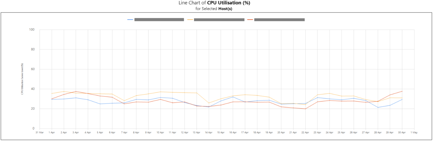
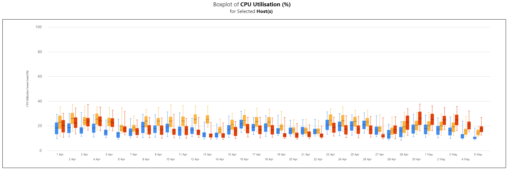
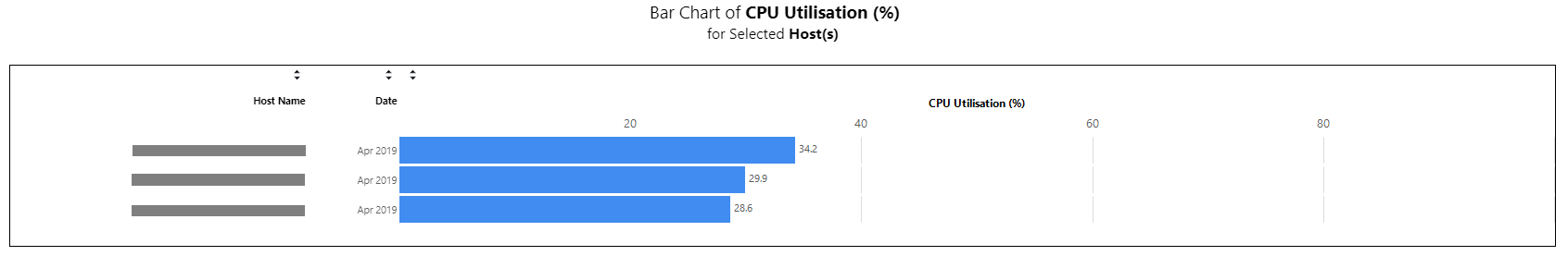
Example Copied
In the images below, you can see examples of line charts, box plots and bar charts and for this report.
Line chart report:
Box plots report:
Bar charts report:
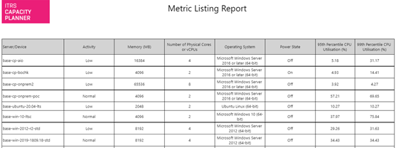
Metric listing Copied
This is a flexible report allowing a tabular display of selected entities with up to 20 metric columns and 20 property columns.
Report parameters Copied
Below are the parameters used to configure this report. For information on parameters that are common across reports, such as entities or grouping filters, see Report parameters.
- Groupings to display — up to 20 properties can be selected for display. If more are selected, only the first 20 are displayed.
- Metric(s) — select one or more metrics.
- Percentile/value — one or more percentiles can be selected for each metric.
- Summarise by grouping — data can either be shown at server level or by grouping value.
- Grouping aggregations — this option is only available where Summarise by grouping has been selected. It allows a max, min, mean, or sum aggregation to be applied to each selected percentile.
Example Copied
In the image below, you can see an example of an output of this report.
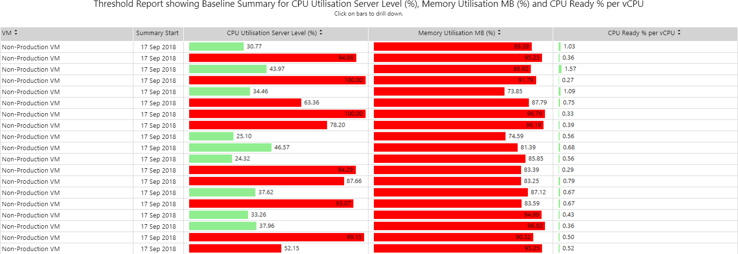
Metric threshold analysis Copied
This report allows you to select a statistical measure for any metric and use it in combination with a threshold. The measure is an indication of how much total time in the chosen baseline period that metric has been above the specified threshold. You can select up to 3 metrics for threshold breach checks.
The report is presented in a visual tabular format of horizontal bar charts. A bar is shown as red if a threshold was crossed.
You can drill through the measures and investigate the time series data for the entity/metric combination. To do this, click the bar for the selected entity.
Example Copied
In the image below, you can see an example of an output of this report. It shows peak CPU, memory and CPU ready% per VCPU over an entire baseline period.
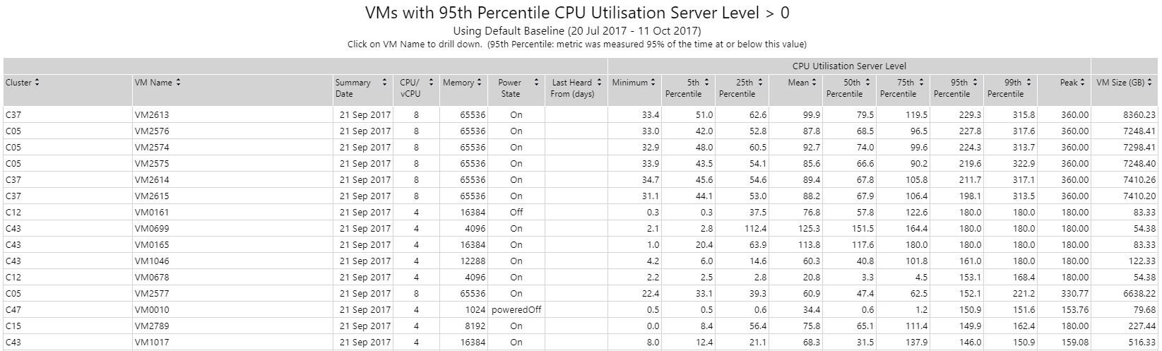
Metric threshold percentiles Copied
This report shows all statistical values for selected entities for a given metric. Statistical values available are: minimum, 5th percentile, 25th percentile, 50th percentile (median), mean, 75th percentile, 95th percentile, 99th percentile, maximum and latest value.
A threshold filter is available to view only those entities that have breached a user-defined threshold. To use this feature, select values for Filter Operator and Filter Threshold. This is particularly useful for identifying very busy or inactive servers. A box plot view is also available by selecting the Chart display type.
You can drill down to further plots and time series for any entity in the table or chart. To do this, click the entity name on the table or the box plot in the chart.
Example Copied
In the image below, you can see an example of an output of this report. It shows all VMs where the 95th percentile of CPU is greater than a specified value. In this case, using 0 shows all measures for this metric for all machines.
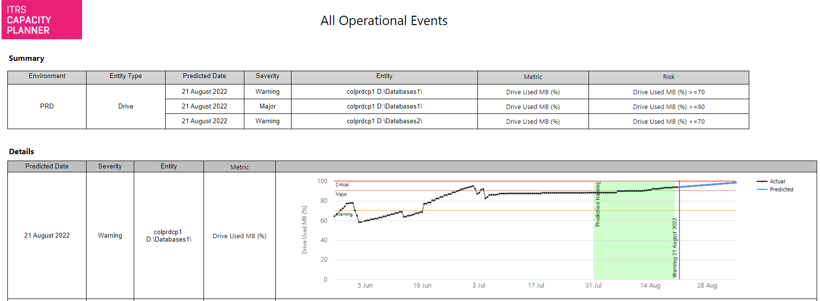
Operational events Copied
This report lists events generated by Capacity Planner on your estate. You can show all events or filter them by baseline view, metric, entity type and selected grouping values.
There are two sections to the report:
- The summary section lists all events, their predicted dates, metric and severity levels.
- The detailed section shows a time series of the specified metric, severity levels, prediction training period and the points at which the time-series is predicted to exceed the relevant level(s).
Report parameters Copied
Below are the parameters used to configure this report. For information on parameters that are common across reports, such as entities or grouping filters, see Report parameters.
- Report title — enables you to specify a custom report title.
Example Copied
In the image below, you can see an example of an output of this report.
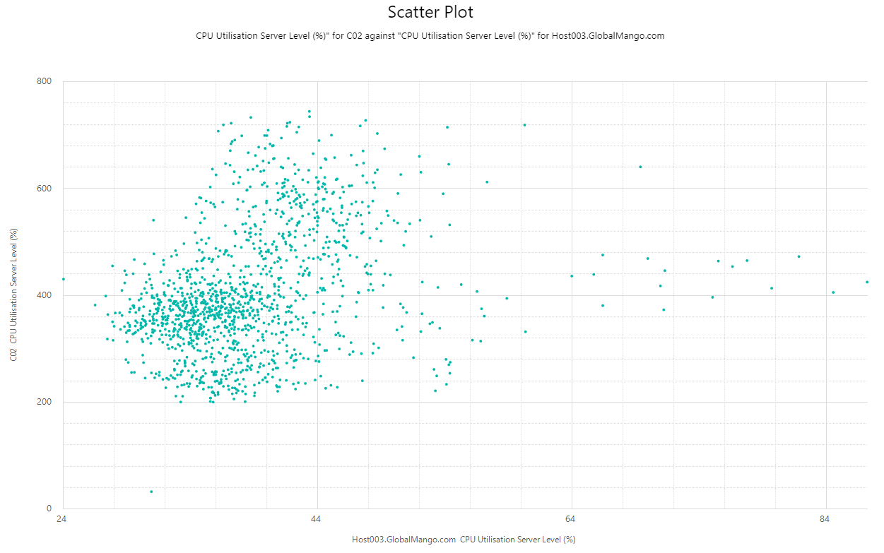
Scatter plot Copied
This report allows you to generate a scatter plot showing metric pairs values from any two entities.
Example Copied
In the image below, you can see an example of an output of this report.
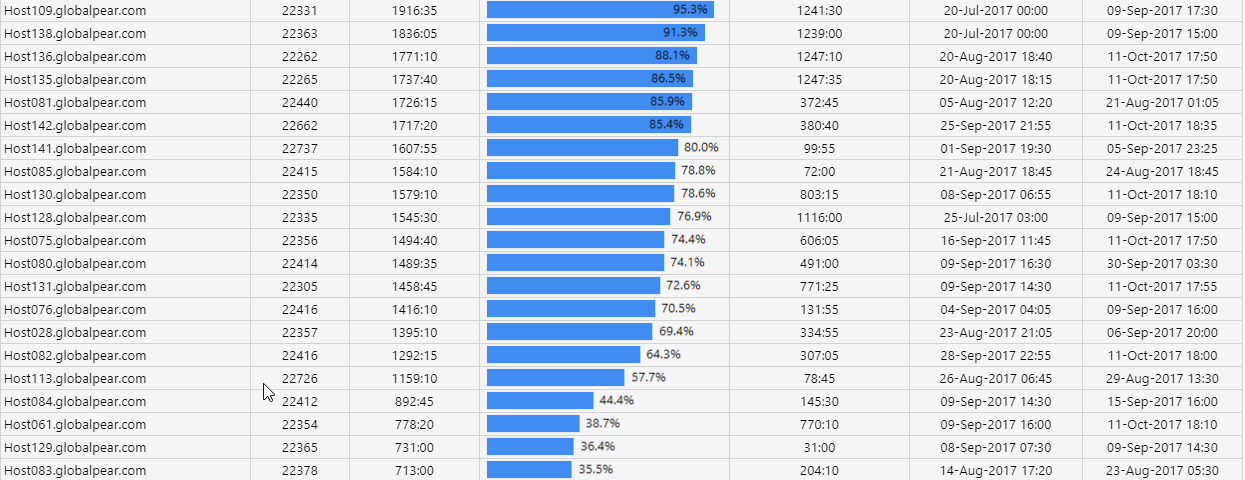
Time above threshold Copied
This report allows you to select a baseline, group of entities, and a metric, and determine the total time spent above a given threshold for each entity. You can also identify the single longest time period for which it was above that threshold. You can filter results further by days of the week and time of day.
You can drill through the length of longest episode for a detailed time series of when that episode occurred.
Example Copied
In the image below, you can see an example of an output of this report.
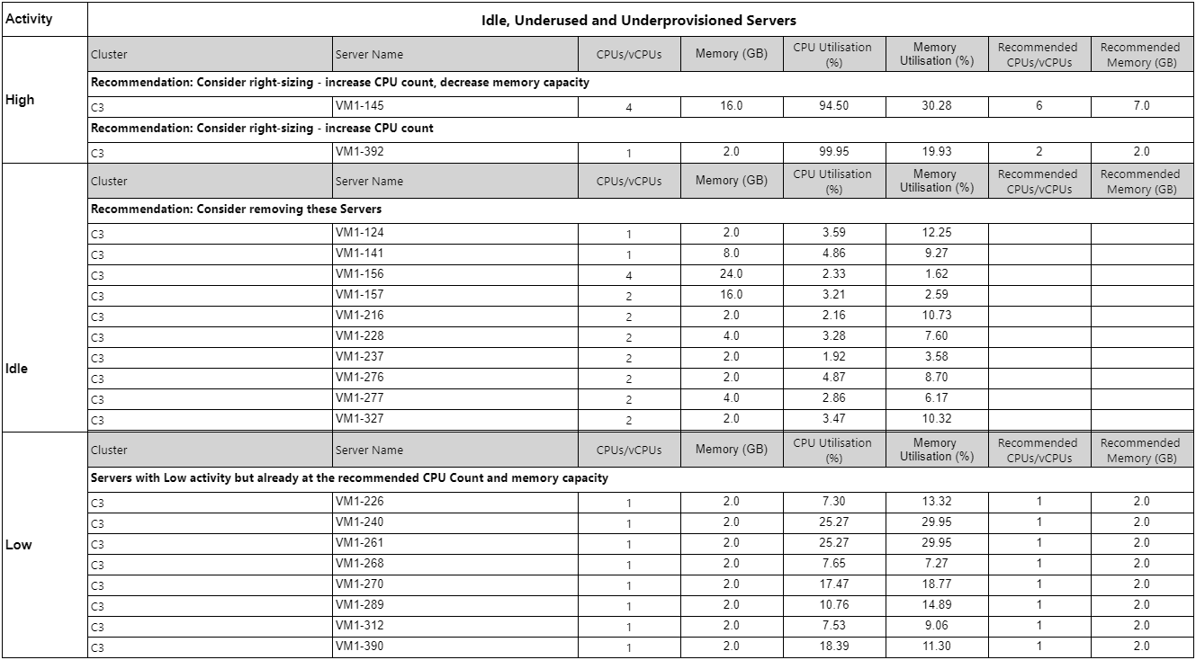
Underprovisioned, underused and idle VMs Copied
This report identifies virtual machines across the baseline period that are underprovisioned, underused (have very low levels of CPU utilization), or idle according to the provided right-sizing settings and it gives appropriate recommendations. By default, these settings are taken from the baseline view but can be changed in the report parameters. Peak, 99th percentile, 95th percentile and mean values are shown for each VM and by default the reports are ordered by peak CPU utilisation (from smallest to largest).
This report allows you to very quickly identify the VMs that can be switched off or ones that spend a significant amount of time inactive, with very small times of peak activity.
Report parameters Copied
Below are the parameters used to configure this report. For information on parameters that are common across reports, such as entities or grouping filters, see Report parameters.
Report Sections to Include — this report is divided into three sections: Idle VMs, Underused VMs, and Underprovisioned VMs. You can decide which sections to display.
Note that if you select more than one section, they are displayed one after another so depending on how much data your report displays, you may need to move through the report pages to see the next section. When exported to Excel, the three sections are displayed in separate worksheets.
Server CPU Percentage — these parameters control how servers are classified within the report:
- Idle Server CPU Percentage — the level at which the VM is considered idle if CPU percentile falls below it.
- Low Server CPU Percentage — the level at which the VM is considered underused if CPU percentile falls below it.
- High Server CPU Percentage — the level at which the VM is considered underprovisioned if CPU percentile falls below it.
Right-size CPU/Memory parameters — indicate the measures you are using across the report:
-
Right-size CPU/Memory Percentile — the percentile value used in right-sizing calculations and recommendations across this report.
-
Right-size Minimum CPUs — the minimum CPU configuration allowable when recommending new configuration for VMs.
-
Right-size Minimum Memory Capacity (GB) — the minimum memory capacity allowable when recommending new configuration for VMs.
-
Right-size CPU (%) — the percentage of capacity that must be reserved when right-sizing to ensure that CPU demand percentile is not above the level of capacity buffer.
-
Right-size Memory Buffer (%) — the percentage of capacity that must be reserved when right-sizing to ensure that memory demand percentile is not above the level of capacity buffer.
Example Copied
In the image below, you can see an example of an output of this report.
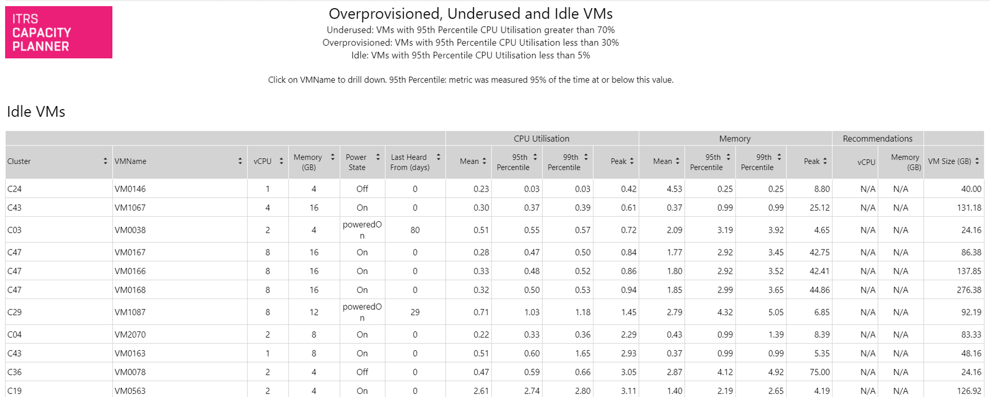
The default sorting can be changed by clicking the arrows above each column to sort by that column.
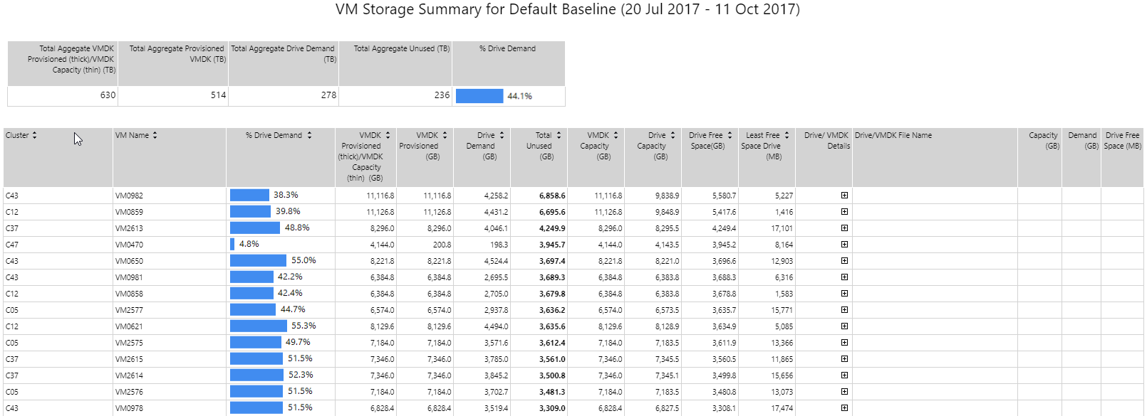
VM storage summary Copied
This report displays the comparison between storage allocated to a virtual machine and storage used by the virtual machine OS drives. It can be used to identify potential storage waste in an environment. The report is ordered by most wasteful VMs. When the report is generated, you can expand on drive details for more information on the VM drives and utilisation compared to allocated thick storage.
When filtering data that should be displayed in the report, you can specify the VM state, Current or Removed. Current VMs are the ones that are still actively generating data.
For investigative or exploratory work, we recommend using the Current state for reporting.
Example Copied
In the image below, you can see an example of an output of this report.
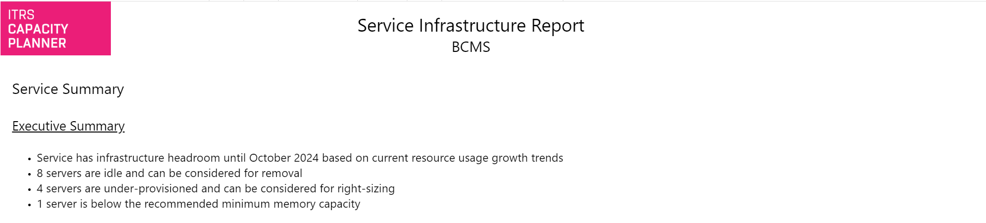
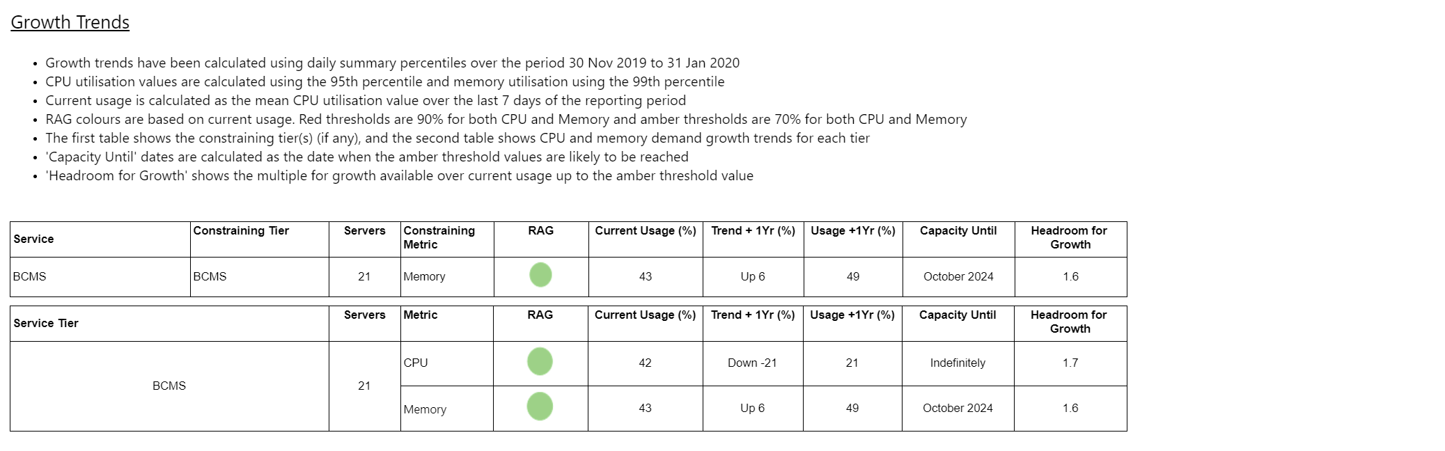
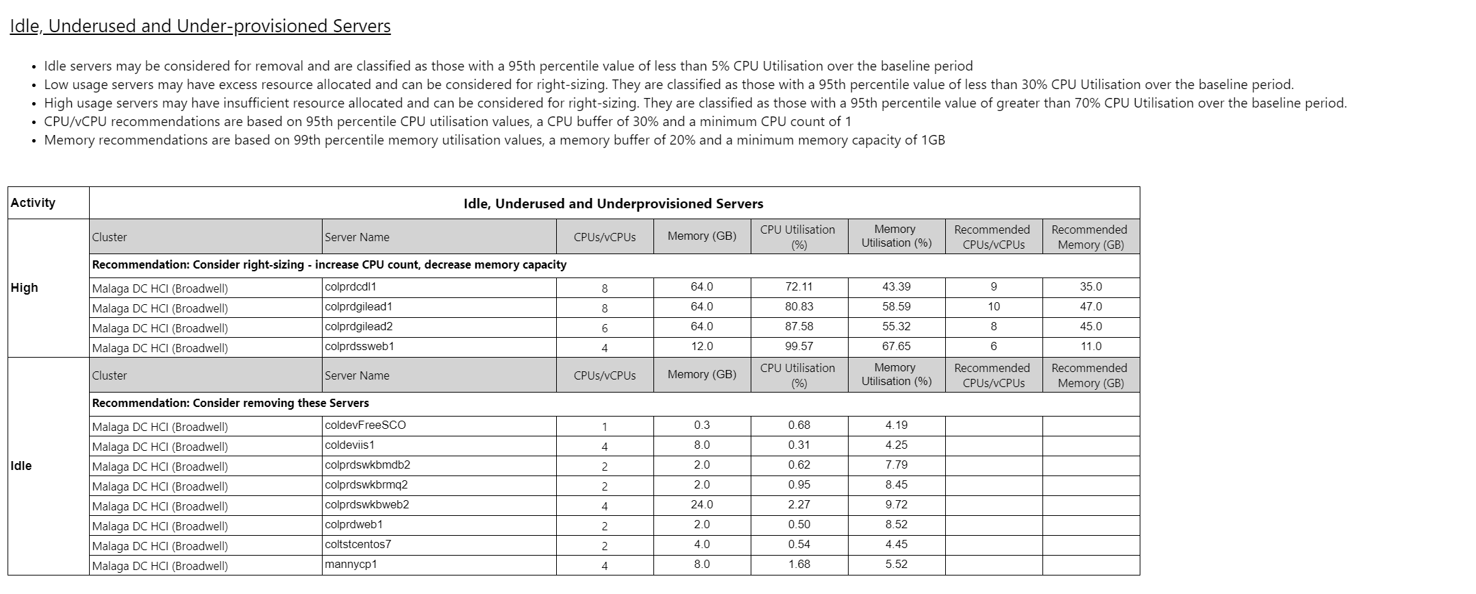
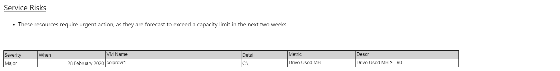
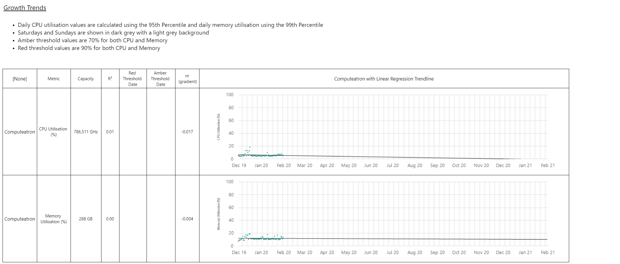
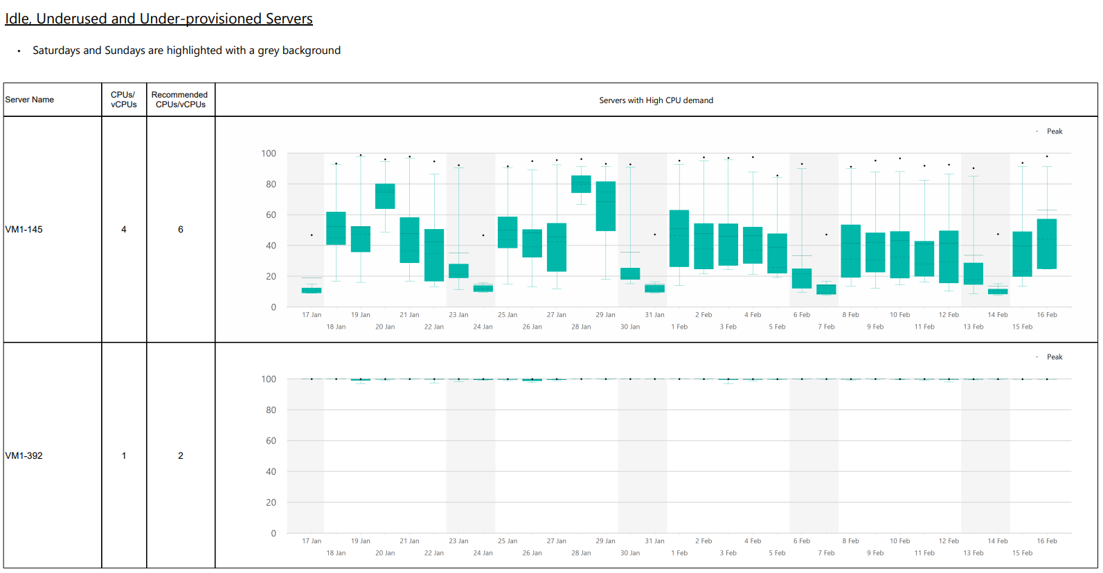
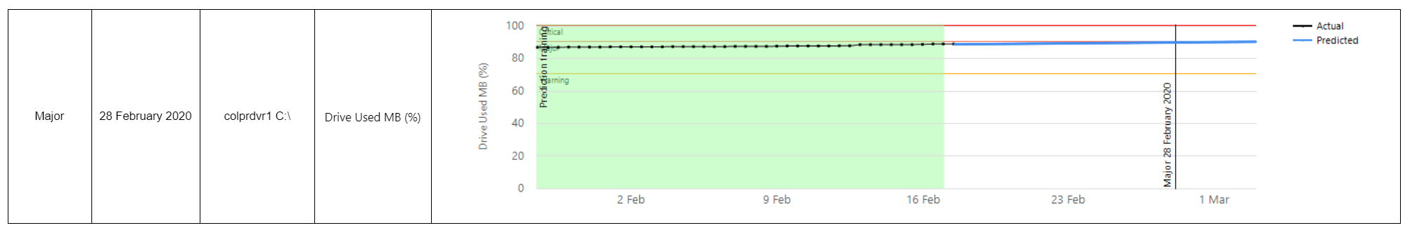
Service infrastructure Copied
This report allows you to select a grouping of workloads and determine the aggregate long term trend in the CPU and memory utilisation across all workloads, report and server activity and short term operation risks discovered through advanced trending algorithms.
Its purpose is to provide a single report that covers everything needed to present a comprehensive capacity summary for an application, service or any common collection of servers that share a Capacity Planner grouping value. It provides long term trends to capacity and recommendation on server activity.
The report displays a service summary with the following information:
- A list of idle, overprovisioned and underprovisioned machines along with right-sizing recommendations.
- When the capacity thresholds will be crossed.
- Headroom for growth.
- Short term operational events in order of criticality (high, idle, low).
- Service risks — resources that require urgent attention.
- Box plot charts for all servers and trend time series.
When you export the report, you can click through from a server summary on the executive summary page of the report to the detailed box plot representation.
There are a number of components to this report:
- The executive summary
- A high-level overview of trends
- Summary of server activity
- Summary of server risks
- Detail on trends
- Detail on server activity
- Detail on service risks
When you configure the report and select the Service Grouping and Service Grouping Values parameters, the remaining parameters are filled with default values that can be changed.
In the Example section below, you can see the output of each of these sections.
Report parameters Copied
Below are the parameters used to configure this report. For information on parameters that are common across reports, such as entities or grouping filters, see Report parameters.
| Parameter | Description |
|---|---|
| Service grouping | The name of the grouping used to filter the reporting server scope. |
| Service grouping value | The value of the grouping. |
| Service subgroup | If modelling of a service is made more complex by shared services, this parameter allows for other grouping values to be included in the report. |
| Service display name | The name used at the top of the report to describe the service. If left blank, the Service grouping value is used. |
| Service tier | If a grouping is used to define tiers of an application, it can be defined here. This ensures that each tier is separated in the report and trended separately. |
| Growth trend model | The model used for calculating long term trends. |
| Growth trend data range type | Defines the point in the data from which the report begins to look back. |
| Growth trend relative range | Specifies how far back the report looks. |
| Growth trend number of time periods | Specifies how many time periods to use in trending. For example, if the value is 6 then this means that the default trend range is 6 full complete calendar months. |
| Growth trend red CPU threshold | The level of the long-term trend that would be flagged as red in the trend summary. |
| Growth trend amber CPU threshold | The level of the long-term trend that would be flagged as amber in the trend summary. |
| Growth trend CPU percentile | The daily percentile measure. |
| Growth trend red memory threshold | The level of the long-term trend that would be flagged as red in the trend summary. |
| Growth trend amber memory threshold | The level of the long-term trend that would be flagged as amber in the trend summary. |
| Growth trend memory percentile | The daily percentile measure. |
| Number of days for current usage | Current usage is the average value of the aggregated percentile selected. When you determine the current usage in the summary, this defines the number of days to use. |
| Growth trend display option | Determines whether to use aggregate raw values or percentages in trending. |
| Idle server CPU percentage | The level at which the server is considered idle if CPU percentile falls below it. |
| Low server CPU percentage | The level at which the server is considered low activity if CPU percentile falls below it. |
| High server CPU percentage | The level at which the server is considered high activity if CPU percentile falls below it. |
| Right size CPU percentile | The percentile value used in right-sizing calculations and recommendations. |
| Right size minimum CPUs | The minimum CPU configuration allowable when recommending new configuration for VMs. |
| Right size memory percentile | The percentile value used in right-sizing calculations and recommendations. |
| Right size minimum memory (GB) | The minimum memory capacity allowable when recommending new configuration for VMs. |
| Right size memory buffer | The percentage of capacity that must be reserved when right-sizing to ensure that memory demand percentile is not above the level of capacity buffer. |
Example Copied
Below, you can see examples of an output of this report.
Executive summary Copied
Summary of trends Copied
Summary of server activity Copied
Summary of service risks Copied
Detail on trends Copied
Detail on server activity Copied
Detail on service risks Copied
Other reports Copied
Except for these advanced reports, you can also create Service and Infrastructure reports directly from a Baseline View scenario model.
For more information see, Infrastructure and service reports.