Report parameters
Overview Copied
Most reports have one or more parameters that allow filtering of report data and specify output formats.
The number and type of parameters vary depending on the type of report but there are some common options. This document describes these parameters.
For details regarding the purpose of each report and what type of information they display, see Available reports
New/Saved report Copied
Select if you want to create a new report or open a saved report. Only saved reports of the same type will appear on this list. For more information on saving a report, see Save as report name
Baseline view Copied
This specifies the baseline model that will be used as the basis for your report. You can select the default baseline or one that you created. Any filters that you saved in the baseline view are also effective in reports.
The baseline determines the period that detailed data is held for. Detailed data is raw data, 5 minute summary or hourly summary. Summary data (daily, weekly, monthly, quarterly) is held for longer and you can report on time periods prior to the start date of the baseline.
Entities and Grouping Filters Copied
An entity is an individual component supplying one or more metrics to Capacity Planner. Each entity is of a specific entity type, for example: cluster, host, VM, physical server, datastore, file ordrive. Most reports allow you to filter the entities displayed in the report.
Grouping filters allow you to narrow down the subset of entities that the report will run against. Each grouping filter has a drop-down menu for the grouping itself and for the value.
Filter by Entity Type Copied
When you select an Entity Type, you can then select one of the options from the Grouping Filter drop-down list:
- [Select all < Entities >] — select all entities of that type. If you select this option, no further filtering for the selected entity is available.
Click here to see an example

- [Select < Entities > from list] — choose specific entities from a list. If you select this option, all available entities of the selected type are listed in the Grouping Value drop-down list. You can then select one or more entries from this list.
Click here to see an example

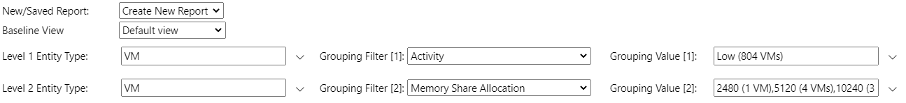
- Filter using a specific entity grouping — you can select an entity grouping from the Grouping Filter list and then use the Grouping Value drop-down list to select one or more values. The number of entities that have each Grouping Value will appear in the list.
Click here to see an example

Using multiple grouping filters Copied
For most reports, up to three levels of filtering are available. Once you set values for Grouping Filter [1], the remaining two levels default to N/A values, but these can be changed if you want to use two or three levels of filtering. Advantages of using two or three levels are:
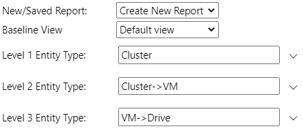
- You can select related entity types and different grouping options. For example, you can use level 1 to select one or more clusters, level 2 to select hosts associated with those clusters, and level 3 to select VMs associated with those hosts.
- You can select the same entity type multiple times, but with different filters to enable a more complex selection, for example, using different groupings together.
Click here to see an example
- Files and drives are only available at level 2 and 3, so to report on these it is necessary to select a parent entity type first. Examples:
- Select VM at Level 1 Entity Type and file/drive at Level 2.
- Select cluster at Level 1 Entity Type, VM at Level 2 and file/drive at Level 3.
Click here to see an example
Metric Copied
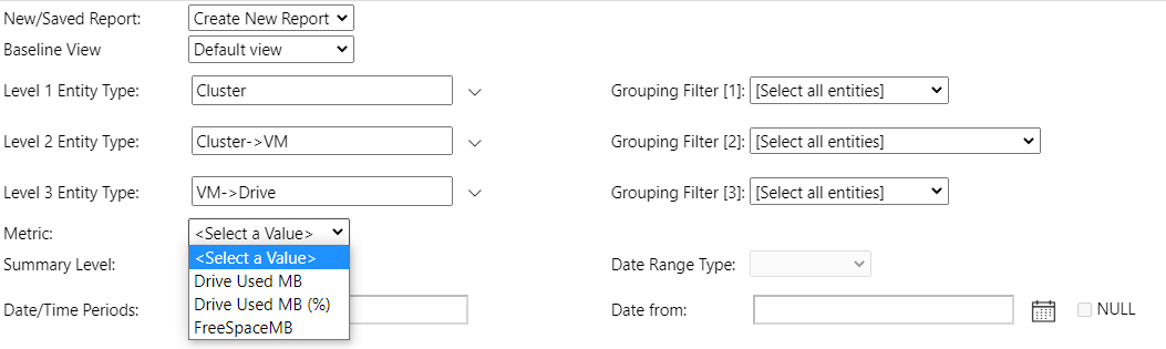
The Metric filter allows you to select which metric to report on. Some reports allow for multiple metrics to be used. If you filter your report by more than one Entity Type then only the metrics available for the lowest Entity Type in the filtering selection are available (for example, if you use 3 levels, then the lowest level is the third one).
For most reports, metrics that are stored with a capacity value have two entries listed, with or without the % sign:
- The entry with the
%sign enables you to view the absolute value of the metric alongside the capacity value. - The entry without the
%sign shows the value as a percentage of the capacity.
Click here to see an example
In this example, Level 1 Entity Type is cluster, Level 2 is VM (VMs that belong to the selected cluster), Level 3 is drive (drives that belong to the selected VMs). The only metrics available are metrics applicable to the selected drives.
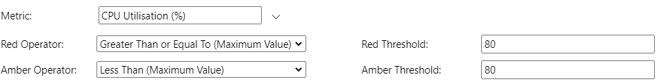
Red and amber thresholds Copied
Red and amber thresholds allow you to specify threshold values against your selected metrics to highlight where these values have been exceeded. You can define the following:
- Red Operator and Amber Operator — allow you to determine how the threshold values are compared to the metric values. For example, greater than, less than, equal to and so on.
- Red Threshold and Amber Threshold — allow you to enter the required threshold values.
Click here to see an example
Summary level Copied
Summary Level allows you to select the aggregation level for the metrics displayed in a report. The summary levels available vary depending on how Capacity Planner is configured for your organisation. For rolling baselines the daily, weekly, monthly, and quarterly summaries are preserved as the baseline moves forward, so the time periods available for these summaries may exceed the baseline date range.
Available levels may include:
- Baseline Summary — provides a single set of statistical measures covering the full baseline period. For rolling baselines, this moves forward in time each time the baseline is processed.
- Monthly Summary — provides a set of statistical measures per calendar month.
- Weekly Summary — provides a set of statistical measures per calendar week.
- Daily Summary — provides a set of statistical measures for each 24-hour period.
- Hourly Average — provides average values for each hour.
- Unaggregated Data — provides values at the frequency of the raw metric data imported into Capacity Planner. For many metrics this is typically 5 minute data. The time required to run reports is strongly related to the number of data points, so running reports using unaggregated data can take a considerable amount of time to complete if an extended date range is used across multiple entities.
Date range type Copied
There are three Date Range Types available:
-
Relative Date Range:
- Relative Date Range from latest data — allows you to choose a range for the report relative to the latest date for which data is available.
- Relative Date Range from today’s date — allows you to choose a date range for the report relative to the date on which the report is run.
If you select one of the relative date range options, the Relative Range drop-down list will get activated. Here you can select the calendar unit, for example months, weeks, or days. In the Date/Time Periods field you can specify how many of these calendar units to include in the report.
Examples:- Select Relative Date Range from today’s date, along with a relative date range of
Latest ‘N’ Monthsand a Date/Time Periods value of2, and run the report on the 7 December. The report includes all available data for November and December. - Select Relative Date Range from today’s date, along with a relative date range of
Latest ‘N’ Complete Monthsand a Date/Time Periods value of2, and run the report on the 7 December. This ensures that only complete calendar periods are considered and the report only includes data from October and November.
-
Specific Date Range — allows you to enter specific dates in the Date from and Date to fields. The date must be entered in US format:
Month/Day/Year HH:MM:SS AM/PM.
Click here to see an example

Chart type Copied
If there are multiple chart types available in a report, you can select which type to display. The available chart types vary depending on the report used and the metrics and summary level selected.
Some charts respond better to different summaries. For example:
- If you use baseline summary or complete 1 calendar month or week, then the best charts to use are the ones that only show a single data point per entry (such as bar chart, radar chart or stacked bar chart).
- If you use a daily summary and there are multiple values , the chart will be drawn for each value.
Available chart types include:
- Box plots
- Bar chart — values are shown as vertical bars.
- Line chart — values are plotted as points on a line.
- Linear trend
- Radar chart — this chart plots all entities on a single radar visualization. It well for comparing metrics but we recommend to use it with a relatively small number of entities to improve readability.
- Scatter plot (metric pairs reversed)
- Scatter plot (metric pairs)
- Stacked bar chart — this chart presents a single bar per date showing the relative metric values.
- Treemap
Box plots Copied
Box plots are only available for daily, weekly, monthly, quarterly, and baseline summary levels. This is the only chart that can display all statistical measures for the selected Summary Level. Other chart types are only able to display one measure, the one selected in the Percentile/Value drop-down list.
Scatter plot Copied
The Scatter Plot (Metric Pairs) and Scatter Plot (Metric Pairs Reversed) are available in the Metric Analysis — Multi-Chart report when two metrics are selected. These charts calculate a linear regression analysis of the metric pair with a trend line, and calculated gradient, intercept, and r2 values. Switching between the two chart types reverses the X and Y axes of the resulting charts. Red and Amber threshold values calculate X axis values from the given Y axis values based on the regression line.
Linear trend Copied
The Linear Trend chart is available in the Metric Analysis — Multi-Chart report and shows a linear regression analysis of single metrics against time with a trend line, and calculated gradient, intercept, and r2 values.
Percentile/Value Copied
For unaggregated data and hourly averages, only a single time series value is available (mean value). For higher summary levels, such as daily summary, a set of statistical measures is available, for example median, 95th percentile, latest value, etc.
Apart from box plots, all other chart types are only able to plot a single measure, so this enables you to select which one is shown on the chart. The selected measure is also used in the calculation of threshold values and for filter values, irrespective of the chart type.
Filter operator and threshold Copied
In some reports, you can filter the used source data values by using the Filter Operator and Threshold.
The Filter Operator allows you to specify how the comparison is made and the Filter Threshold allows you to specify the threshold value. The Filter Operator acts on the selected Percentile/Value.
If the chart type is Scatter Plot (Metric Pairs), Scatter Plot (Metric Pairs Reversed), or Linear Trend then additional options of filtering by r2 values appear in the list.
Y-Axis scale Copied
You can decide what Y-Axis scale to use:
- 0 - 100 — fixes the y-axis to display the values from
0to100. This is useful for metrics that are percentages, but if used with metrics with values that are outside of this range, not all data points are visible on the chart. - Scale to fit — automatically scales the y-axis to ensure all data points fit on the chart.
Legend Copied
You can decide what to display in the legend of your report or you can hide the legend completely. Options in the Legend parameter depend on the type of the report you created.
Show/Hide capacity Copied
Metric Capacity can be shown alongside metric values, which is particularly useful where metrics are shown as absolute values rather than percentages. This option controls whether capacity values are shown or hidden.
Report size Copied
Some reports may take a long time to generate when a large number of data points need to be plotted. The Report Size option allows you to specify if you want to wait on the report to run to completion based on the number of rows of data generated by the report. If a report data set is larger than the selected value, you are alerted and have the option to increase the allowable report dataset size.
Top (N) Copied
Top (N) allows you to filter the report to show only the outcomes with either the top N highest values or top N lowest values for a metric. Top (N) can be configured to either be ascending or descending. You can then select the value of N.
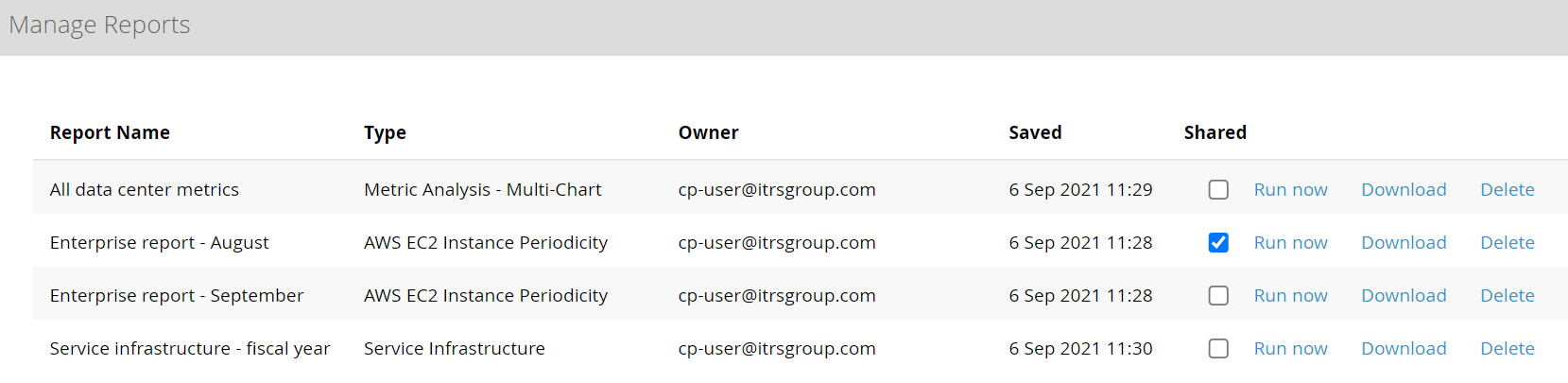
Save as Report Name Copied
This parameter allows you to save the report with all the parameters that you input and rerun it in the future.
To be able to rerun a report with the same set of parameters, follow the steps:
- Input all parameters that you need to run the report.
- Provide a name for your report as the Save as Report Name parameter.
- View the report when all parameters are provided. This saves your report.
You can now access the report with your saved parameters in the following way:
- From the Reporting home page, under Saved Reports.
- From the New/Saved Report drop-down list of a report. Only saved reports of the same type will appear on this list.
If you change the Save as Report Name parameter of a saved report, a new saved report is created.
To download the saved report in an XLS format or to delete it, open the list of all saved reports from the Reporting home page.
To share the saved report with users who have access to the same project, tick the Shared box.