If you are currently using version 5.x.x, we advise you to upgrade to the latest version before the EOL date. You can find the latest documentation here.
Object Inspector
Overview
The Object Inspector dockable displays the style and properties of the selected shapes, and dataset of the charts when an object from the Active Dashboard is selected.
Note: Beginning Geneos 5.8.x, the undo and redo key functions, CTRL + Z and CTRL + Y, are supported in Active Console and Gateway Setup Editor for the following: text fields, multiline texts, and editable drop-down fields.
To open the Object Inspector dockable:
- Go to View > Active Dashboards in the Active Console.
- Click Show Object Inspector
 .
.
You can still edit the object's attributes through its Properties dialog. For more information, see Configure basic shape properties.
Use Object Inspector with no object selected
When there is no object selected, you can use the Object Inspector dockable to modify the style and properties of the Active Dashboard canvas.
The Style tab has the following options:
| Field | Description |
|---|---|
| Fill Colour | Sets the background colour of the Active Dashboard canvas. |
| Grid line Colour | Sets the colour of the grid lines. |
| Zoom Factor |
Expands or shrinks the canvas view. Default: 100 Unit: Percentage (%) |
| Grid Size |
Sets the size of the grid lines (horizontal and vertical lines). Default: 20 |
| Visible Grid lines |
Enables or disables the grid lines (horizontal and vertical lines). Default: Enabled |
| Snap to grid |
Moves the selected object to the nearest intersection of lines in the grid. Default: Disabled |
The Properties tab allows you to modify these settings:
| Field | Description |
|---|---|
| Allowable Actions |
Controls the following actions and selections in the Active Dashboard canvas:
By default, all of these options are enabled. |
| Exporting | Modify settings when exporting the Active Dashboard canvas. |
| Status Bar |
Enables or disables the status bar in the Active Dashboard canvas. Default: true |
| Startup Settings |
Clears the historical data. Default: Disabled |
Configure objects using the Object Inspector dockable
When you select an object, the Object Inspector dockable shows the Style tab of the selected object. This tab contains the appearance and text layout settings for the applicable objects. Modifying the object's properties on the Style tab applies the changes in real-time.
Note: Selecting multiple objects simultaneously might disable the other options you can modify on the Style tab of the Object Inspector dockable. The settings that are available vary depending on the selected object.
The Style tab of the selected object allows you to modify these settings:
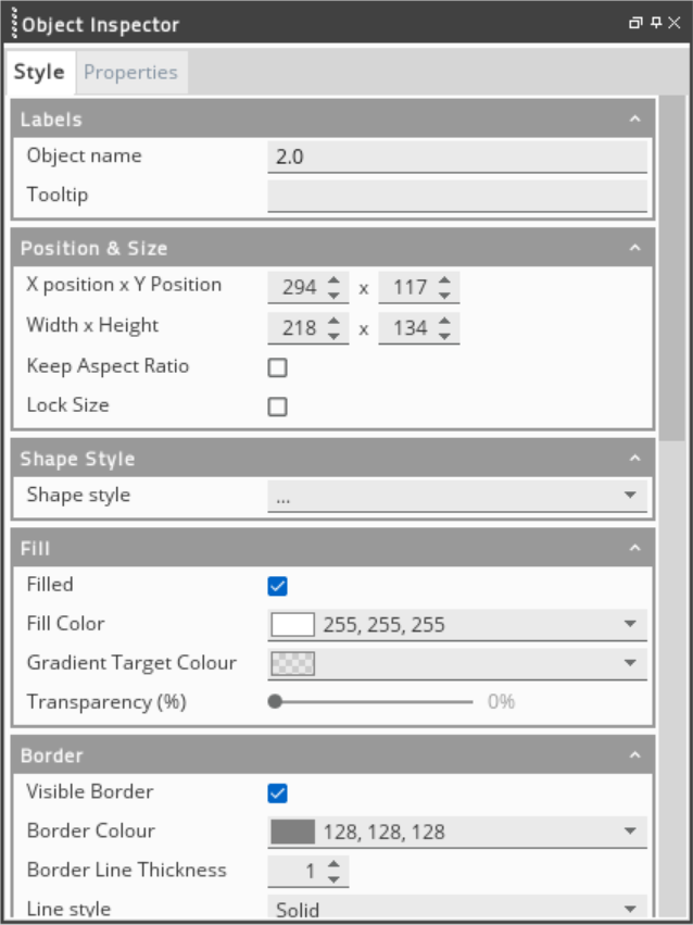
| Field | Description |
|---|---|
| Labels | Modifies the object's name and tooltip. |
| Position & Size |
Configures the following settings:
Note: For some objects, you can only modify the size and position settings. The other settings are not editable. |
| Shape Style | Changes the size of the selected object. |
| Fill | Sets the colour and transparency of the selected object. |
| Border |
Configures the following settings:
|
| Text | Sets the style, size, colour and transparency of the text. |
For more information on the dashboard object properties dialog, see Configure basic shape properties in Active Dashboard Palette.
To add or edit a modifier and link using the Object Inspector:
- Go to View > Active Dashboards in the Active Console.
- Select any object from the Active Dashboard Palette screen.
- Drag and drop the selected object into the Active Dashboard canvas. Selecting the object enables the Modifiers and Links section in the Object Inspector dockable making the Add and Delete buttons become clickable.
- Edit the Modifiers and Links sections on the Properties tab.
- Press Enter to save the changes.
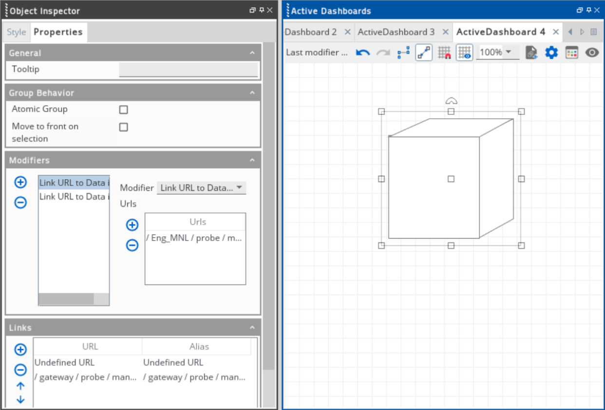
Modify object properties
Selecting multiple objects simultaneously may disable the other options that you can modify on the Properties tab of the Object Inspector dockable.
The Tooltip, Atomic Group, and Move to front on selection options only apply to some objects.
Configure numeric fields
The fields that require a numerical value on the Properties tab do not accept an empty value. If you configure these fields and leave them empty, the Object Inspector automatically generates a value that depends on how you delete the initial value. The value will only change after you click outside of the Properties tab.
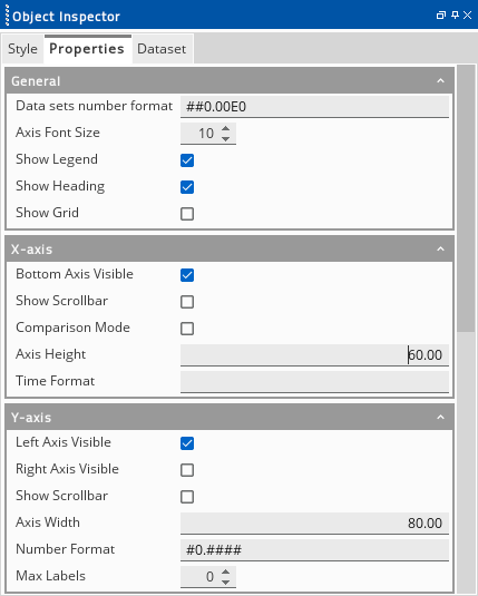
The screenshot below shows some properties of a Line Chart. The fields that require a numerical value are Axis Font Size, Axis Height, Axis Width, and Max Labels.
In this example, you want to configure the Axis Height field which has a value of 60.00:
- If you put your text cursor at the start of the value, before
|60.00as shown in the screenshot, and you press forward Delete to delete the text before the text cursor, then this converts the value to0.00after clicking outside of the Properties tab.
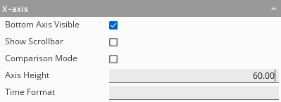
- If you put your text cursor at the end of the value, after
60.00|as shown in the screenshot below, and you press Backspace to delete the text to the left of the text cursor, then this converts the value to6.00after clicking outside of the Properties tab.
This behaviour is important for you to consider when configuring any properties of an object with numeric fields.
Configure the dataset of the object
Note: Beginning Active Console 5.5.x, the Managed Entity display name is used in the user readable path. This also reflects in the charts and widgets legends in the Active Dashboard. For dashboards that are configured in the Active Console 5.4.x and below, the user readable path of the charts and widgets legends retain its original value. However, you can manually update the display names.
When a Widget type object is selected, the Dataset tab appears in the Object Inspector dockable.
Note: Beginning Active Console 5.8.x, you can modify the title of the widgets in the Object Inspector dockable. The Title field appears either in the Style or Properties setting of the selected widget.
Widget objects include:
- Active Pie Chart
- Active Gauge
- Area Chart
- Bar Chart
- Half Gauge
- Line Chart
- Scatter Plot
- Spark Chart
- Step Graph
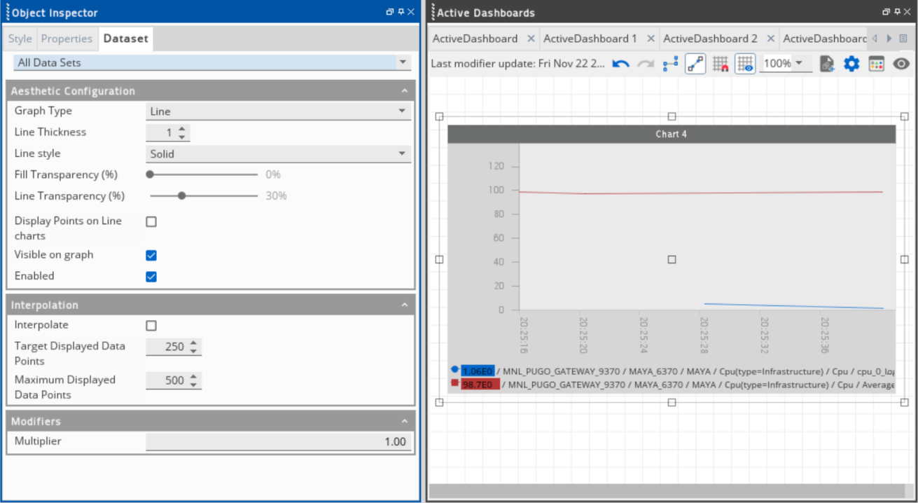
The Dataset tab has the following options:
| Field | Description |
|---|---|
| Connection Configuration | Displays the name of the chart and identifies the path where the data item came from. |
| Aesthetic Configuration |
Modifies the aesthetic settings of the selected chart, including its type, style, and transparency. |
| Interpolation |
Adjusts the target and maximum number of displayed data points. Default: Enabled |
| Modifiers | Adjusts the multiplier value in the selected chart. |
Note: The Style and Properties settings for charts have different options compared to the other objects that you can modify in the Object Inspector dockable. In addition, the settings available vary depending on the selected object.