If you are currently using version 5.x.x, we advise you to upgrade to the latest version before the EOL date. You can find the latest documentation here.
List View
Overview
The List View is a dockable that can be configured to display a set of related data items. It can be configured to display:
- All critical managed entities of all connected Gateways.
- All data items that are snoozed.
- All data items that are assigned to a user.
By default, a new workspace contains the following list views:
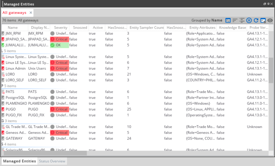
- Managed Entities — displays all managed entities relative to the selected data item in the State Tree dockable. See Entities dockable.
- Status Overview — contains the Critical and Warning (Under Selection), Netprobe Issues, and Sampling Errors tab. See Status Overview.
All list views provide the following options on their status bar:
| List view options | Description |
|---|---|
|
Mode
|
Changes the mode according to:
|
|
Sort
|
Sorts the list view by a selected property. |
|
Group
|
Groups the list view by a selected property. Groups are dynamic. If a data item is removed from the view and it is empty, then the list view removes the group. Each group has an icon and colour that defines the severity within the group. |
|
Pause list view
Resume list view
|
Stops and resumes the list view to update. When you pause a list view, the Active Consoledoes not update the list view in general. No items can be added or removed, and the data items do not change. An indication that a list view has stopped is when the blue bar appears on the status bar.
|
|
Refresh the view
|
Updates the list view based on the current state of the connected Gateway. |
|
Configure the view
|
Displays the list view settings where you can edit its properties. |
|
Hide the status bar
|
Hides the status bar in the list view dockable. |
List View settings
A list view setting can be defined on a list view dockable and at the workspace level. To open the List View settings, click Configure the view .
.
These functions are referred to as the list view settings hierarchy:
- Application level — settings that are hard-coded in the application. This cannot be changed.
- Workspace level — all list views inherit the settings provided within the workspace, unless you modify the settings at the dockable level. For more information, see Workspace level list view.
- Dockable level — all list views within the dockable level inherit the settings.
- List view level — settings configured directly in a list view. This ignores all parent settings.
These are the properties that you can modify in the List View settings:
- Content Paths — defines the paths that populates the list view.
- Filters — sets temporary filters on the list view which restrict the data items that displayed.
- Drag and Drop — defines what should happen when data items and other paths are dropped into the list view.
- General Visual — defines some general aesthetic properties of the list view.
- Details View — specifies other visual aspects of the details (table) mode of the list view.
- Properties — selects which data item properties are listed in the view.
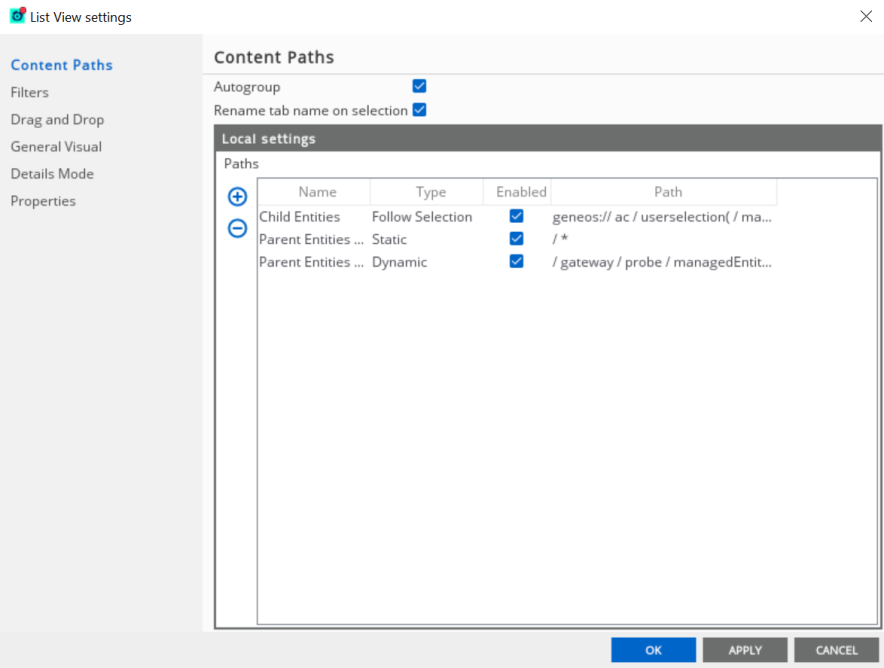
Content Paths settings
This setting allows you to add, remove, and edit the paths that populate a list view.
These are the fields that you can modify:
| Field | Description |
|---|---|
| Autogroup |
If enabled, the view is grouped by a property depending on the selected dockable each time a selection occurs. Note: This setting only works if at least one path is configured as Follow User Selection. |
| Rename tab name on selection | If enabled, renames the tab depending on the selected dockable. |
| Name | Name of the path. It is only significant for static paths. |
| Type |
Type of path. This can be static, dynamic, or follow selection. For more information, see Types of path |
| Enabled | Toggles whether the path populates the list view. Otherwise, the path does not contribute data items. |
| Path | Actual path which data items must match to end up in the list view. |
Populate list views
To create a path, follow these instructions:
- Click Add
 in the Local settings group.
 - Enter the name of the path in the Name field.
- Click the row in the Type column and select the appropriate type of path.
- Click the row in the Path field to edit the path properties.
- Click OK to save the changes.
Here are some example paths and data items:
//managedentity (severity =
 critical)
— creates a list view with all critical managed entities.//managedentity (snoozed = false)//cell (severity > 1)— all cells that have a severity ofwarningorcriticalthat are in a managed entity which is not snoozed.//* (snoozed = true)— a list view configured with a single path matches all snoozed items in the system. If you snooze an item, it appears in the list view. If it is unsnoozed, then the system removes it.
Note: Paths are shown in a user readable form. You cannot enter these directly in the field.
Types of path
There are three main types of path that can be configured within a list view:
| Path | Description |
|---|---|
| Dynamic |
All data items that match the specified path at any given point in time are displayed in the list view. If a given data item matches more than one configured dynamic path in a single list view, then that data item only appears once. |
| Static |
Data items that match a path are automatically grouped according to the value of the path’s Name field. Unlike a dynamic path, a single data item that is matched by multiple configured paths can appear multiple times. For example, if the data item is matched by two configured paths, then that data item appears twice on the list view. Below is the behaviour of the list view depending on the number of matching data items:
|
| Follow Selection |
The data items that appear on the list view are dependent on the path configured and the data item selected on either the State Tree or Gateways dockables. Unlike the static and dynamic paths, a Follow Selection path is composed of a Geneos URL, rather than a data item path. Here are some examples:
|
Filters settings
Filters can be defined in a list view by applying the configured filter on all the data items that are present in the list view.
Note: Filters can only be defined on a list view. These cannot be defined at a dockable level.
By default, the first logic value of the filter is "None". These are the settings that you can modify:
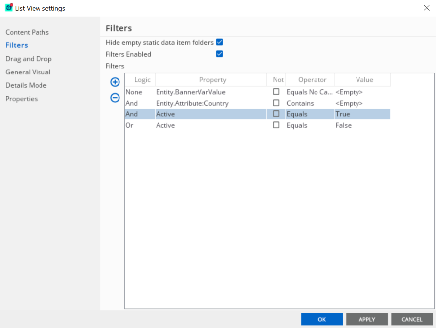
| Field | Description |
|---|---|
| Hide empty static date item folders |
This only applies to static paths. When enabled, static paths with zero matches are hidden from the list view. |
| Filters Enabled | Enables and disables the filtering function. |
| Logic |
Combines two or more filters using the It defaults to |
| Property | The data item property to which the filter is applied to. |
| Not | When enabled, the inverse of the filter is applied to the list view. |
| Operator |
Conditional operators that match the configured value:
|
| Value | Actual value that needs to be matched. |
To add a filter, follow these steps:
- Click Add in the Filters group. This adds a new row.
- Click the new row and select the logic value (the Logic displays
Noneif you only have one filter). - Select a property on the Property menu.
- Select or clear the Not check box.
- Select the appropriate operator on the Operator menu.
- Enter the value in the Value field.
- Click OK to save the changes.
You may add more filters as needed.
Drag and drop settings
When you drag and drop a data from the State Tree, Gateways, or Metrics dockable into a list view, the list view’s configured drag and drop rules are applied to it.
The path of the dropped data item is added as a new row on the Content Paths settings.
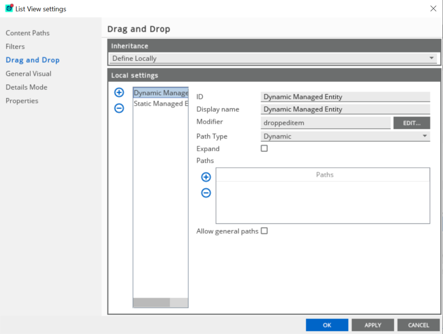
These are the fields that you can modify:
| Field | Description |
|---|---|
| Inheritance |
Inherits the drag and drop configuration from the parent dockable or workspace, or define it locally on the list view or dockable. Default value: Inherit from Dockable level settings |
| ID | Name of the drag and drop rule. |
| Display name |
The value is only applied when the path type field is set to static. When set to static, it follows the behaviour of a static path type. If the Path Type field is set to Dynamic, the data items are displayed normally which their icons and relevant data item names are displayed. |
| Modifier |
Configures the paths of the data items relative to the dropped data item. For example, it can be configured to display all dropped data item’s children that has a critical severity. The path for this example is as follows: droppeditem()/append(//*[(state("severity")="3")])
The modifier’s path also determines the path that is added on the Content Paths settings. Using the modifier path above, the content path resolves to: sgeneos/gateway[(@name="<data item’s Gateway>")]/directory/probe[(@name="<data item’s
Netprobe>")]//*[(state("severity")="3")]
Default value: droppeditem() |
| Path Type | Defines the type of paths to be used on the list view. |
| Expand |
In the Modifier field, the modified path is added on the Content Paths settings. If enabled, the path on the Content Path is expanded to include the exact paths of the displayed data item. Default value: Disabled. This only works if the path field is set to dynamic. |
| Paths |
The paths added to this filter are the only ones displayed on the list view. For example, using the following settings:
The list view only accepts a dropped data item that is a Managed Entity. If the dropped data item is a Sampler, it displays nothing. Multiple path filters can be added. The Active Console applies the
The list view only accepts either a Managed Entity or a Sampler dropped data item. This setting is useful when the modifier is configured to display the children of a data item. This prevents accidentally adding a parent that has lots of children, such as a Gateway. |
| Allow general paths |
If enabled, Folders (Logical Attribute Folders) that can be found in the State Tree dockable (Logical Mode should be enabled) can be dropped on the list view. |
Apply drag and drop rules
To apply or edit your drag and drop rules:
- Go to List View settings > Drag and Drop.
- Select Define Locally on the Inheritance menu. Otherwise, the rules inherit the Dockable level settings.
- Click Add in the Local settings.
- Fill out the ID and Display name.
- Click Edit in the Modifier field to modify the path. To know more about editing a path, see Path Editor.
- Click OK to save the changes.
General visual settings
The General Visual settings allows you to modify the aesthetic properties of the list view.
It contains the following settings:
| Field | Description |
|---|---|
| Inheritance |
Inherits the visual configuration from the parent dockable or workspace, or define it locally on the list view or dockable. Default value: Define Locally |
| Background Colour | Defines the background colour of the list view. |
| Default Mode | Defines the mode of the list view. |
| Custom tab name | Name of the list view as it appears on the tab. It can also be edited directly by double-clicking on the tab. |
Details mode settings
The Details Mode allows you to modify the visual settings of the list view:
| Field | Description |
|---|---|
| Inheritance |
Inherits the visual configuration from the parent dockable or workspace, or define it locally on the list view or dockable. Default value: Some settings are defined locally (RowHeight, ShowRootHandles, ShowTreeNodelines, TreeLineColour, SortEnabled) |
| Row Height |
Defines the height of each row. Unit: pixels |
| Show Root Handles |
defines whether the expand/retract buttons should be displayed to the left of the root level items (folders). If these are not displayed, you can still access the expand/retract functions by double-clicking the row. |
| Show Tree Lines | Determines whether to show the lines that connect the child nodes to the parent within the tree. |
| Tree Line Colour | Sets the colour of the tree lines. |
| Sorted | Sorts the view. |
In the Details mode, the columns at the top are defined by the properties that are configured in the list view.
These can be changed in the following ways:
- Order — columns can be rearrange by pressing the column name, then dragging them to the desired location.
- Changed in width — allows you to manually adjust the column. Alternatively, right-click the column name to select from these options:
- Set Column Size
- Auto Resize This Column
- Auto Resize All Columns
- Hide/Show all hidden columns — right-click the column name to hide the selected data item. The Show all hidden columns option only appears if there is an existing hidden column in the managed entity.
There are two ways of removing columns from the details mode:
- Right-click on the column heading and select Hide This Column. This temporarily removes the column from the details mode, but in the background the value is still present in the list view.
- Use the properties dialog to remove the property from the list view. This completely removes the property from the list view. Removing a column rather than hiding it lowers the CPU and memory footprint of the list view on the machine where it is running on.
The column settings for a list view are persisted in the workspace, and restored on load.
Properties settings
The Properties settings modify the columns or properties present on the list view. Its inheritance settings default value is Inherit from Dockable level settings.
The main setting is formatted into a table form, also known as a matrix. The rows contain the property names and the columns contain the data item names, such as the Gateway and sampler.
The check marks that intersect the row and column, also known as the delta, mean that the property is available to the data item. Blank cells denote the inverse which is the property is not available on that data item.
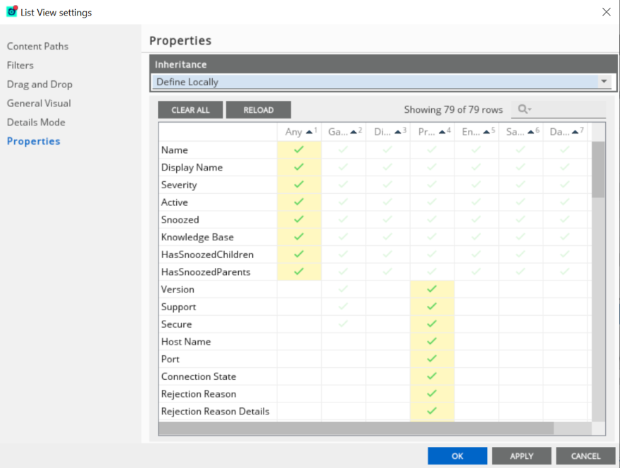
The following row values represent the following:
- A grey check mark indicates that the property is available, but not selected. Therefore, property does not appear in the view.
- A green check mark indicates that it is available and is selected. Therefore, the property appears in the list view if there is at least one suitable data item type.
The search field on the properties settings window can be used to search a given property or a data item. The table changes depending on the keyword used.
Workspace level list view
The Workspace level list view settings allow the modification of a list view at the dockable level. This means that this is the parent setting that is inherited by all child list views.
To access this setting, go to Tools > Workspace Level List View Settings.
List view template editor
The Template Editor allows you to create a new icon view mode and modify the Netprobe view mode.
To create a new mode, follow these steps:
- Go to Tools > Workspace Level List View Settings > Templates.
- Click Add in the Template Table group.
- Double-click the new icon in the Preview column. The List View Template Editor appears.
- Change the size and content of the icon depending on your preference.
- Drag and drop variables from the toolbar into the container. Only variables within the container appears in the list view.
- Click OK to save the changes.
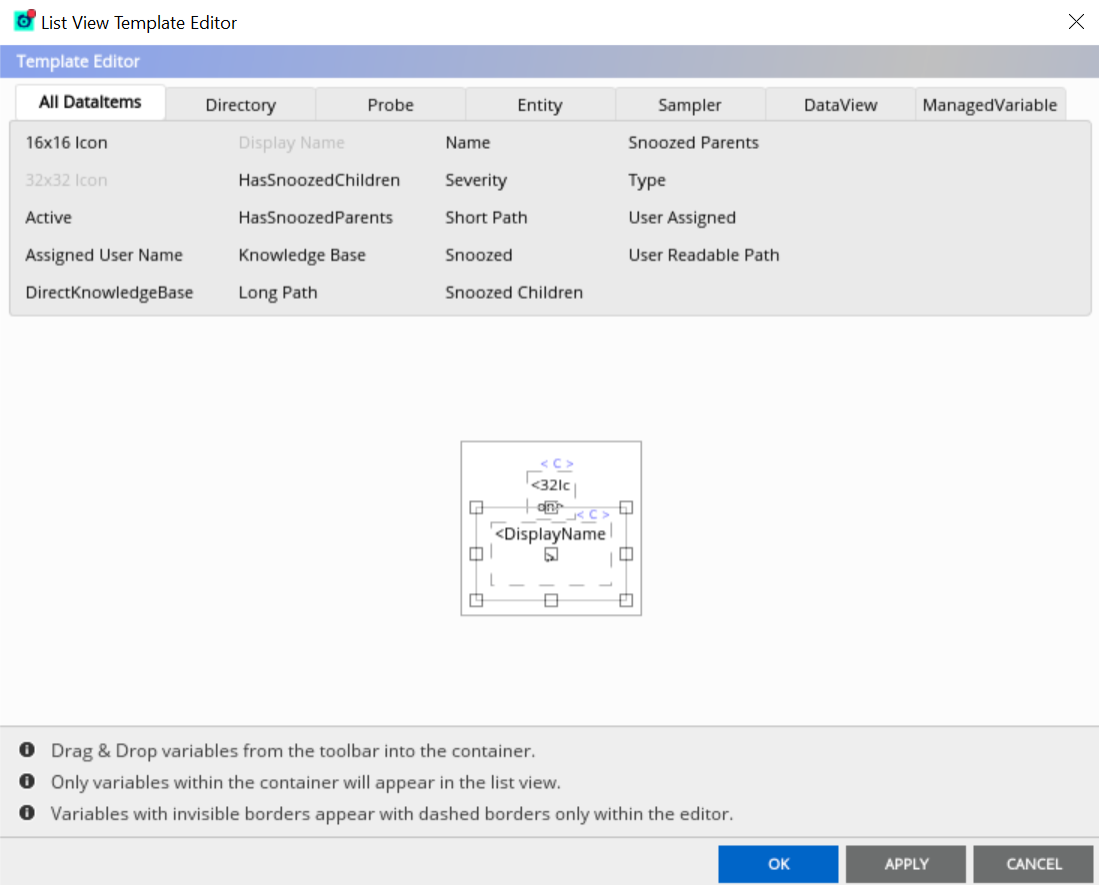
There is a default outline in the List View Template Editor that represents a single instance of a data item in a list view configured with your selected mode. This contains the number of data item properties to be displayed for all data items represented by the mode.
The size and shape of each data item the template is used to represent is defined by the boundary. You can also add new properties in the editor.
To add or edit the properties of the data item, follow these steps:
- Drag and drag any data items in the container.
- Right-click the selected data item.
- Click Properties.
- Go to Layout Variable Settings to modify the properties.
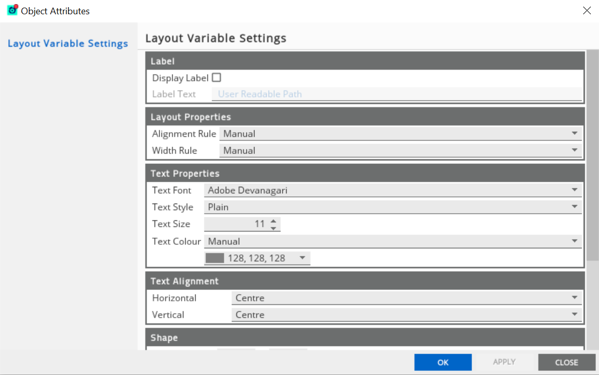
The Layout Variable Settings allows you to modify the following properties:
- Display Label
- Layout Properties
- Text Properties
- Text Alignment
Import and export list views and list view dockables
Individual list views and entire list view dockables can be exported. This can be useful for sharing list view configurations or for creating a backup for each list view.
To export a list view, follow these steps:
- Right-click the list view.
- Click Export > Configuration.
- Enter the file name.
- Click Save.
This gives you an .ltv extension name.
To export a list view dockable, follow these steps:
- Go to View > Dockable Manager or press CTRL + D.
- Right-click the list view dockable you want to export.
- Click Export.
- Enter the file name.
- Click Save.
This gives you an .ado extension name. Exporting an entire list view dockable includes all the settings at a dockable level and all existing list views (tab) created within the dockable.
To import a list view and list view dockable into your workspace, go to File > Import.
Entities dockable
The Entities dockable is an instance of a list view. It is configured as default in a new workspace.
When following user selection, it displays all the entities relevant to the selected item:
- if a Gateway is selected, it display all the entities connected to that Gateway.
- if a dataview is selected, it displays the entity that is an ancestor to that dataview.
The first tab is also configured to auto-group based on the user selection.
If additional tabs are added, these are configured only to display the entities. When you drag and drop data items into these tabs, the following occur:
- Drop global state, a Gateway, Netprobe, or view path folder — the entities within these items appear in the view. The contents automatically update as these entities change, including the creation of new entities or removal of existing ones.
- Drop an entity — if you drop an
entity, you can choose between two outcomes:
- The entity only appears in the list view if the managed entity is connected to the console (using a Dynamic path).
- There is always an entry on the tab for the entity, regardless of its connection status (Static).
- Drop a sample, data view or cell — locates the entity that is an ancestor of the selected data item, and add it to the tab.
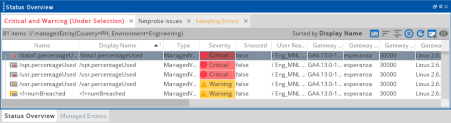
Status Overview
To open the Status Overview, click View > Status Overview. By default, the Status Overview displays these tabs:
- Critical and Warning (Under Selection) — displays all cells with a
WarningorCriticalseverity relative to the selected data item. - Netprobe Issues — lists all Netprobes that have a
connectionStatenot equal toUP(disconnected Netprobes). - Sampling Errors — lists all samplers that have a
samplingStatusvalue that is not equal toOK.
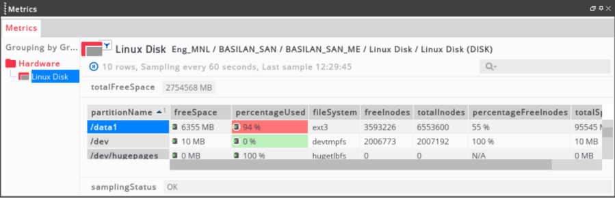
When you click a row in the Critical and Warning (Under Selection), it opens the data item in the Metrics dataview. For example, the first data item on this list, which refers to /data1.percentageUsed:
This displays its managed entity and sampler the Metrics dataview: