Overview
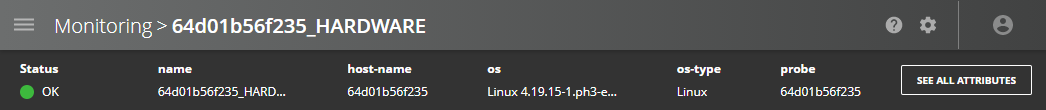
The Entity overview page provides detailed information about a particular entity. From this page, you can monitor both the instantaneous and historical value of metrics associated with the entity.
The entity monitoring page is composed of four sections:
- Attributes — shows the values of important attributes of the selected entity.
- Metrics — lists all the metrics associated with the selected entity.
- Metric history — shows a graph of the selected metric's value over time.
- Related events — lists the events related to the selected metric.
Attributes
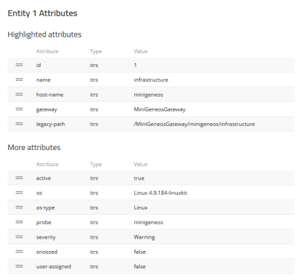
The Attributes header shows the current value of five of the attributes associated with the selected entity. The selection of attributes shown can be configured from the Attributes list.
To open the Attributes list, click See All Attributes.
Attributes list
The attributes list shows all the available attributes, their type, and their value for the selected entity. The first five attributes are shown in the Attributes header of the entity overview and in the tooltips on the Monitoring page.
The order of the Attributes list is user configurable, to change the order:
- Click Edit order.
- Drag the Attributes into the desired order using the handles.
- Click Done.
Note: The changes to the order of attributes will affect all entities and will also change which attributes appear in tooltips.
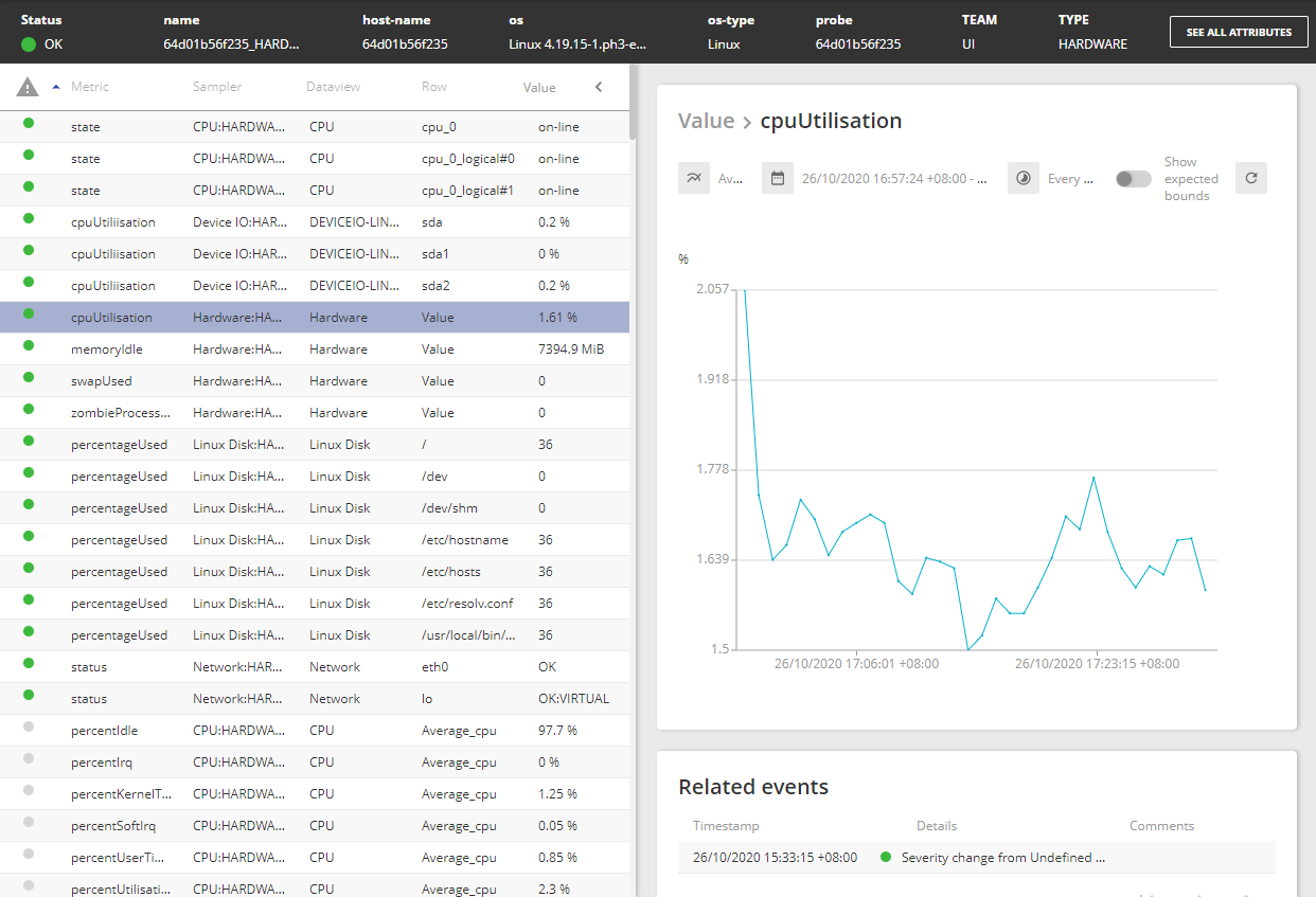
Metrics
The Metrics table lists all of the metrics associated with the selected entity.
| Column name | Description |
|---|---|
| Metric | Name of the metric. |
| Sampler | Sampler used to collect this metric's data. |
| Dataview | Dataview where this metric is shown. |
| Row | Row of the dataview where this metric is shown. |
| Value | Value of the metric. |
Select a column name to sort the table by that property. By default, the table is sorted by status.
Select a metric in the Metric table to display the metrics history and related events.
You can also filter the list by typing the keyword in a column header:

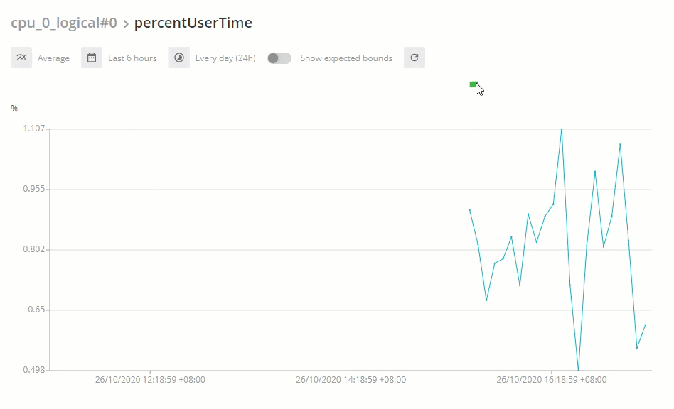
Metric history
The Metric history panel shows a graph of the values of the selected metric over time, you can customise how this data is displayed. This requires that Gateway Hub has been setup to store metric and event history.
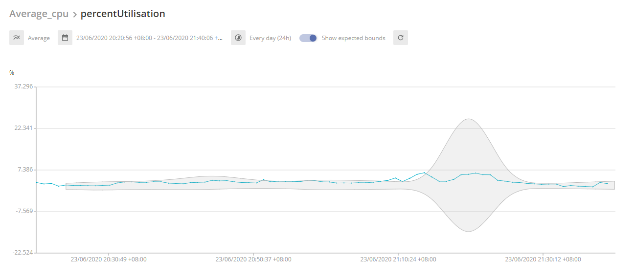
When you enable the Show expected bounds option, the expected bounds become visible for the entire displayed period. For example, when you select Today on the Date and time > Presets drop-down menu, you should be able to see the expected bounds for the entire day.
You can set the seasonal granularity in the Gateway Setup Editor, this determines how long an interval each value in the time series represents. However, Web Console will only display data at intervals as low as 5 minutes which is the minimum granularity for a seasonal request.
For more information about granularity, see Algorithm — Seasonal-quick in Data Sets (Time Series).
If the expected bounds to not display correctly, you may have encountered a timeout error. For more information, see Increase Web Console read timeout in Troubleshooting User Guide.
The following options are available in the Metric history:
Display events overlay in the entity metrics chart
The events overlay in the chart allows you to view the aggregated information of the selected entity, such as the Critical, Warning, and OK status.
The status information of an entity at each point in time is also shown, using severity colour coding, above the chart.
In the example below, the status indicators ( ) show places where the aggregated information is available when you hover over the chart:
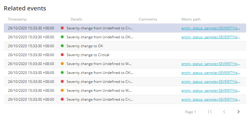
Related events
The Related events table shows the events, such as severity changes, associated with the selected metric.
| Column name | Description |
|---|---|
| Timestamp | The time the event occurred, shown in the format dd/mm/yyyy <time>. |
| Details | Brief description of the event. |
| Comments | Comments attached to the event. |
| Metric path | Path to the metric. |