Overview
Dashboards allow you to configure a custom set of visualisations using metrics from one, or many entities.
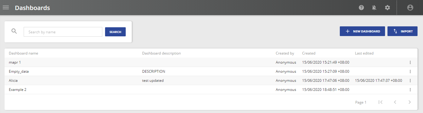
Dashboards home
The Dashboards home page shows a list of all available Dashboards and their status. You can create and delete Dashboards from this page.
The Dashboards list shows the following properties:
| Column name | Description |
|---|---|
| Dashboard description | Description of the Dashboard. |
| Created by | User that created the Dashboard. |
| Created | Date and time the Dashboard was created. |
| Last edited | Date and time the Dashboard was last edited. |
Create a Dashboard
To create a new Dashboard:
- Click New Dashboard. This opens the New Dashboard menu.
- Specify a Dashboard name.
- Specify a Dashboard description.
- Click Create Dashboard.
Import a Dashboard
To import a Dashboard:
- Click Import next to New Dashboard. This opens your file viewer.
- Select a dashboard file to import.
Alternatively, you can drag and drop the dashboard file from your local machine into the Dashboard's table.
When a dashboard file is imported successfully, the file is uploaded to Gateway Hub and the Created by field is assigned to the current user.
Manage Dashboards
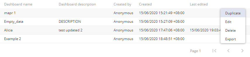
You can manage each Dashboard from the manage menu on each list entry.
| Option | Description |
|---|---|
| Duplicate |
Create a copy of the Dashboard. |
| Edit |
Open the Edit Dashboard menu. This menu allows you to set the Dashboard name and description. |
| Delete | Delete the Dashboard. |
| Export | Download the selected dashboard in .json format to your local machine. |
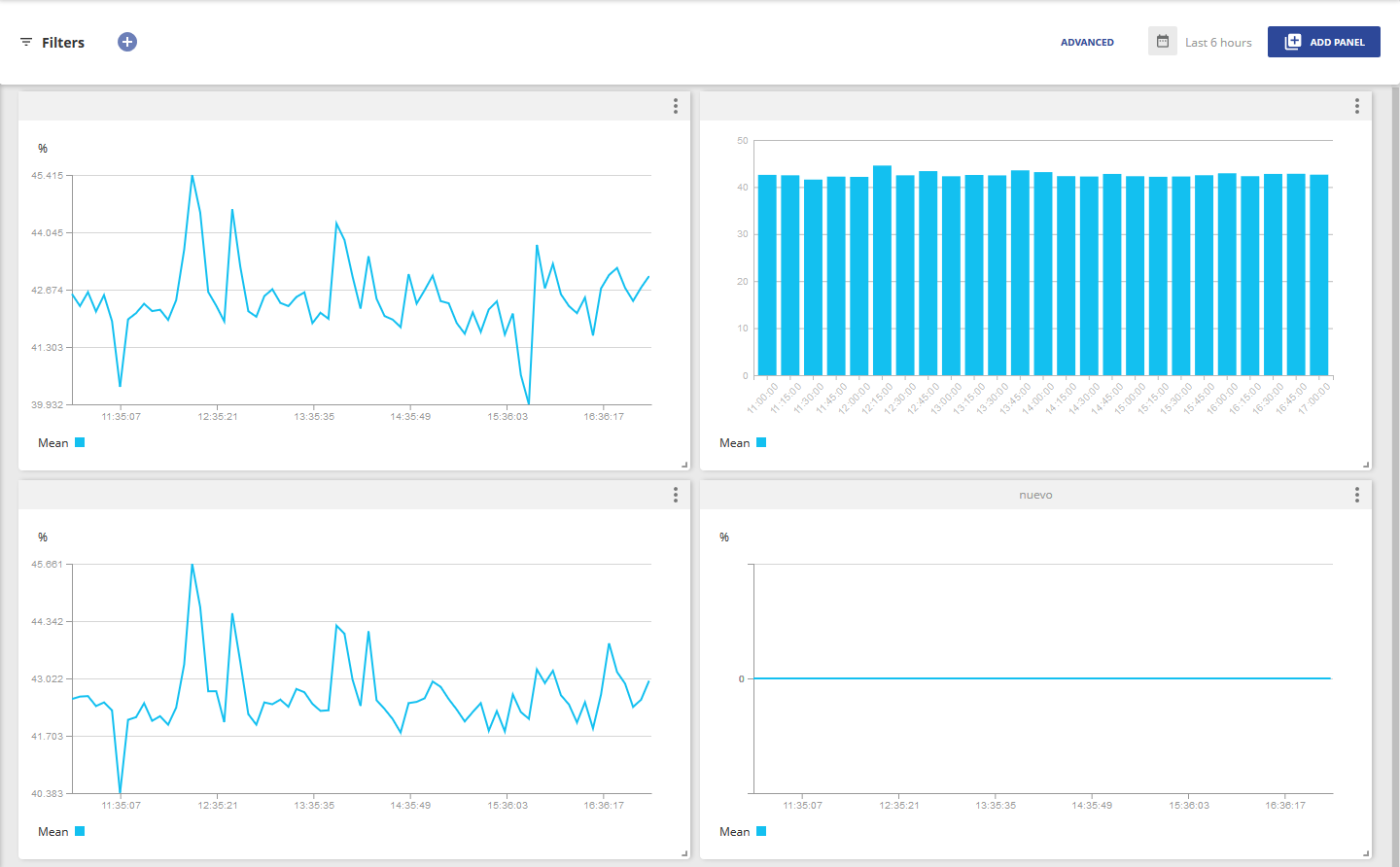
Dashboard view
The Dashboard view contains user configurable Widgets. Each Panel visualises data from one metric in a user configurable way.
Configure date range
To set the date range:
- Click Date and Time

- Specify a time range. You can specify a custom range or select from the available presets.
Note: Setting the date range affects all Panels in a Dashboard.
Set global parameter
To set the Global parameter, create a Basic or Advanced filter.
For more information about filters, see Filters in Monitoring.
Panels
To create a new Panel:
- Click Add Panel. This opens the Panel configuration tool.
- Configure the Panel.
- Click Create Panel.
You can move Panels around the Dashboard by clicking and dragging the title bar.
You can resize Panels by clicking and dragging the caret at the bottom right of each Panel.
Configure a Panel
The Panel configuration tool consists of three tabs:
A preview of the Panel is shown on the right hand side of the page.
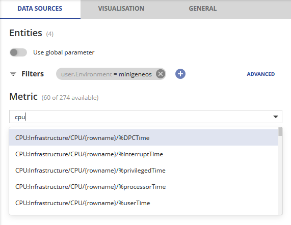
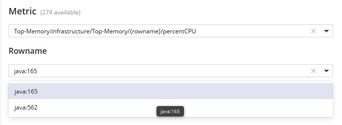
Data sources
This tab allows you to select the metric to be visualised. By default, this tab shows the metrics of all available entities.
Click to select a metric.
Global parameter
You can specify if the target entity is determined by a filter set on the Panel or by enabling the Use Global parameter option.
The Global parameter is determined by the filter specified in the Dashboard view.
Filter
You can filter the entities shown using either Basic or Advanced queries to quickly find those of interest.
The number of selected entities is shown below the filter. If a query returns multiple entities, identical metrics from each entity are combined into a single metric. Aggregations are performed on these combined metrics.
Visualisation
This tab allows you to select which aggregations will be applied to the data, and how the data will be visualised.
For more information on aggregations, see Aggregations in Retrieve Data from Gateway Hub.
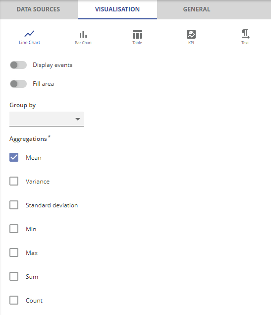
| Visualisation | Description |
|---|---|
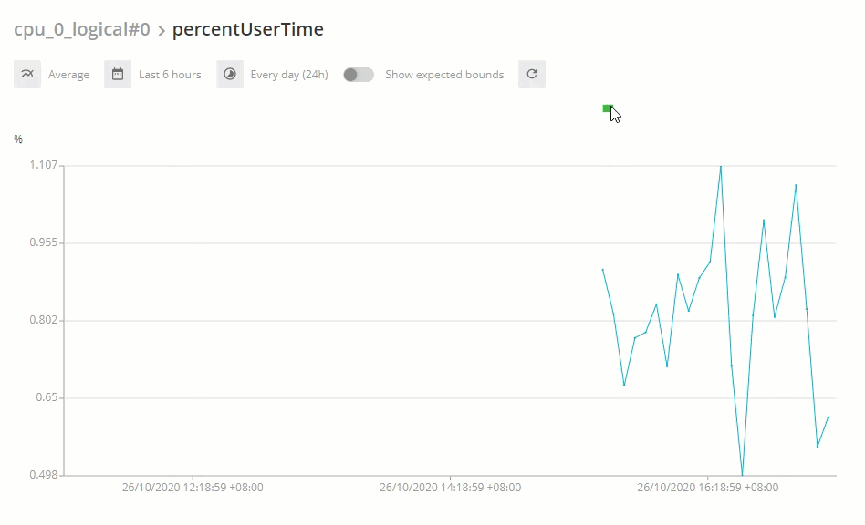
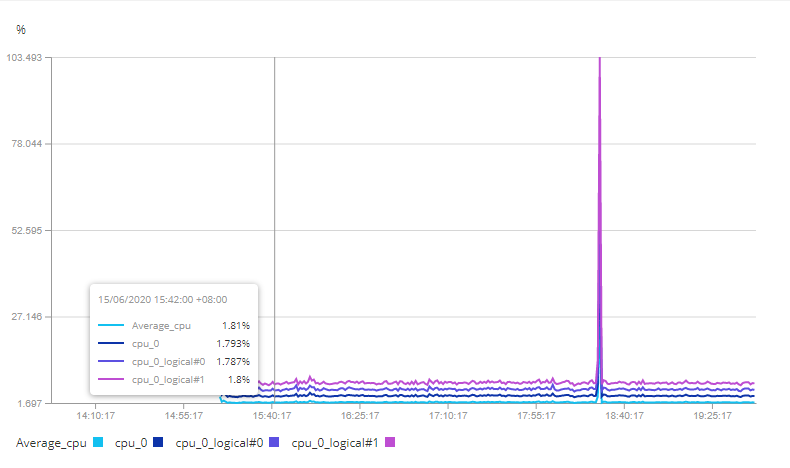
| Line Chart |
Plots the selected metric aggregation against time. You can select multiple aggregations, these are displayed together. Other options that you can configure in Line Chart:
|
| Bar Chart |
Plots the value of the selected metric aggregation at bucketed time intervals. |
| Table |
Displays the value of the selected metric aggregation at bucketed time intervals. You can select multiple aggregations, these are displayed in columns. |
| KPI |
Displays a performance indicator with the most recent value of the selected metric aggregation. You can specify the colour and icon that are displayed with the KPI at different thresholds of the metric aggregation value. The default display properties are set as BASE. |
| Text | Displays specified text. No data is visualised when this option is selected. |
Stacked groups
You can enable the Stacked groups option by selecting an attribute in the Group by drop-down menu:
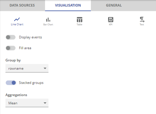
In this example, the data sources are grouped according to rowname. Since the Stacked groups option is enabled, the chart displays a series of lines that do not overlap because these lines are cumulative at each point:
Display events overlay in the dashboard panels
The events overlay in the chart allows you to view the aggregated information of the selected entity, such as the Critical, Warning, and OK status.
The status information of an entity at each point in time is also shown, using severity colour coding, above the chart.
In the example below, the status indicators ( ) show places where the aggregated information is available when you hover over the chart: