Interact with the timeburst
Overview Copied
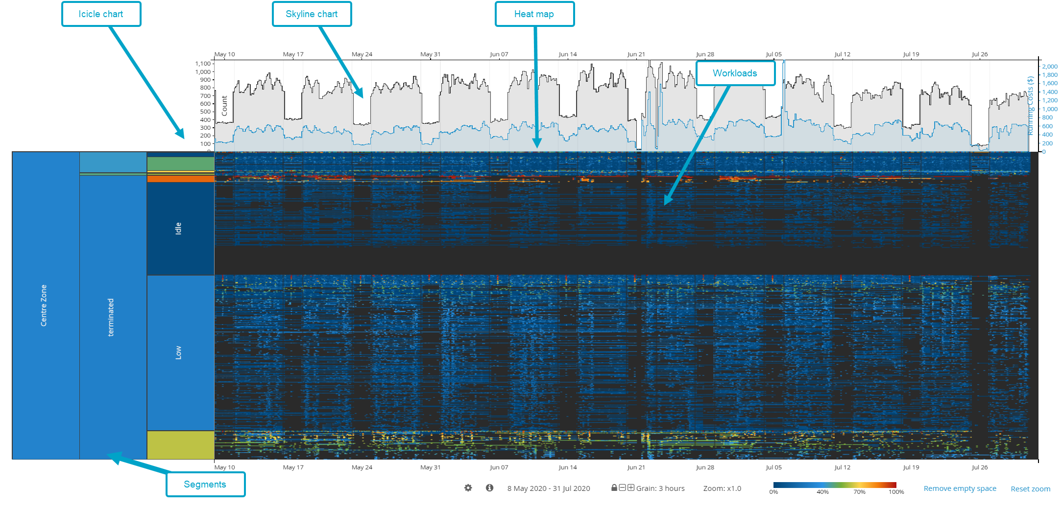
The timeburst is the central part of the screen where your Baseline View is visualised. You can switch from the sunburst to the timeburst view using the View menu in the application menu bar or by right-clicking a segment in the sunburst and selecting Show timeburst view.
The timeburst provides a time dimension version to the sunburst. In the sunburst, all machines or instances are represented in the same way regardless of how long they have been running. For example, there is no difference in the representation of a machine that ran for an hour and one that ran 24/7, or when machines were active and when these were not.
In the timeburst, you can find daily patterns and visualise application behaviour. You can observe the activity levels of all your workloads based on which you can see that potential savings could be made if, for example, idle machines are switched off. For more information about potential savings and cloud optimisation options, see Recommend.
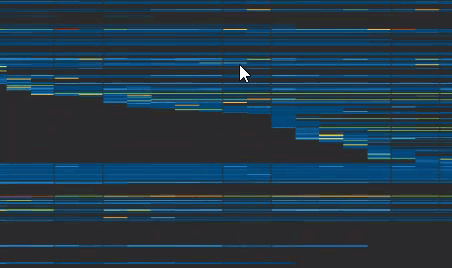
The timeburst is a rectangular representation of the sunburst with segments displayed in the same hierarchy. Graphically, it is divided into the following elements:
- The icicle chart with segments on the left-hand side.
- Radiating outwards, there is a line for every workload. The line goes from the beginning of the data and gives you an indication of when these workloads were running.
- If you hover over a workload, you can see its details on the left-hand side.
- To the right of the segments is the heat map of the workload utilisation.
- Along the top of the chart is a skyline chart which displays the number of workloads that were running at a given point of time and their running costs. By default, daily granularity is displayed.
- Each entry in a cell is a machine that has been running during that day.
Timeburst colours Copied
- Blue areas of the timeburst indicate periods of time when the server had low levels of utilisation.
- Black areas of the timeburst indicate periods of time when servers were switched off.
For more information on the usage of colour schemes, see Sunburst colours.
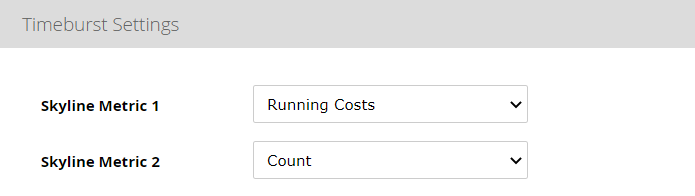
Adjust the skyline chart Copied
The skyline chart displays the number of workloads that were running at a given point in time, as well as the aggregate running costs for that time grain. The value is the combined total price for all instances running at that point in time.
By default, daily granularity is displayed. You can change it using the controls below the timeburst.
The count and the running costs Copied
The count and the running costs are shown on the skyline chart:
- The count chart is grey, with the axis on the left-hand side.
- The running costs chart is blue, with the axis on the right-hand side.
To enable or disable these metrics from the chart, click ![]() below the timeburst to open the settings.
below the timeburst to open the settings.
Aggregate costs and counts for the instances currently in view within the heatmap component of the timeburst are also displayed on a dynamic bar chart to the right of the timeburst. Using it, it is possible to quickly navigate to the most expensive areas of your cloud compute spend.
Inactivity highlighting Copied
Areas of idle time can be highlighted in the timeburst to help you quickly identify time period of low activity.
For example, the timeburst can show you points when you had 10 hours or more of CPU below 5%. You can also view a summation of the times when instances meet the threshold criteria on the skyline and the right hand side timeseries.
To enable the highlighting on the chart, click ![]() below the timeburst to open the settings and configure the following:
below the timeburst to open the settings and configure the following:
- Enabled — turns the feature on and off.
- Timespan (hrs) — the number of contiguous timeperiods for the highlighting to appear.
- Metric value (%) — metric value below which the timeperiod will be considered for highlighting. The value needs to be between 0 and 100.

Zoom the segment Copied
In the timeburst, segments are represented in an icicle chart on the left. If you want to concentrate on viewing and analysing just one segment, you can zoom in on it. Zooming allows you to view a subsection of your Baseline View by temporarily hiding all other segments.
- To zoom in to a segment, double-click the segment you wish to zoom in to.
The timeburst is redrawn from the perspective of the segment you zoomed in to. On the toolbar, the navigation breadcrumbs are updated to show the position of the segment in the Baseline View hierarchy. You can choose to zoom in further or zoom out again to view more of your Baseline View. As you zoom in, the granularity becomes more detailed. - To zoom out of a segment, use the navigation breadcrumbs in the toolbar. Click the segment you wish to zoom out to. You can also double click on a parent segment in the icicle chart.
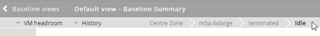
Zooming out restores the details and view further up in the hierarchy of your Baseline View. The timeburst is redrawn from the perspective of a parent grouping.
Zoom the heat map Copied
The heat map can be zoomed in a few different ways, depending on what detailed data you want to see:
- To zoom in the heat map x-axis horizontally, scroll the mouse wheel.
- To zoom in the heat map chart y-axis vertically, hold
CTRLand scroll the mouse wheel.- As you zoom in further, the names of your machines will appear on the heat map.
- As you zoom in further, the names of your machines will appear on the heat map.
- To zoom in a region of the heat map, hold
Shiftand draw the region with the mouse.
- Double click the skyline to zoom into the selected day.
- To zoom out, scroll in the opposite direction.
You can also click and drag the heat map around when it is zoomed in.
Remove empty space from the heat map Copied
As you zoom in the heat map, you may end up with black lines which indicate that there is no data because the machines you are seeing were not running at the period of time you are looking at. These machines appear on your heat map because these are currently running or were running at another point of time, but were switched off in the period that you zoomed into.
Too much empty space like this may make it difficult to analyse the data. To clear the view from the empty space, click Remove empty space below the heat map.
When you start zooming again, the empty space reappears.
Change the granularity of data Copied
By default, daily granularity of data is displayed in the timeburst. To change it, use the controls below the timeburst or click the current value to open the Timeburst Grain Picker.
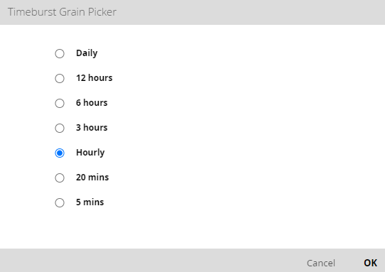
You can also change the date range directly in the timeburst.
Exclude values from the view Copied
If you think you are looking at too much information, but do not want to zoom in and miss something at the higher levels, you can hide individual segments on the Baseline View to streamline your view. Hidden segments can be restored as needed.
Hide a segment Copied
To hide a segment:
- Right-click the segment you want to hide.
- Click the Exclude this grouping value option from the list.
When a segment is hidden, its usage data is not used in calculating the overall Baseline View usage. As a result of hiding a segment, you might see:
- Parent segment’s width changing.
- Parent segment’s colour changing to account for not using the hidden child segment’s usage data.
- Child segments being removed (if the segment you hide has them).
- Fewer workloads appearing on the outside of the chart.
Restore a segment Copied
To restore a segment:
- In the configuration panel list on the left, click Groupings.
The Groupings panel opens with the list of all active and available groupings.
If there are any values hidden from the view, a filter icon appears next to the grouping:
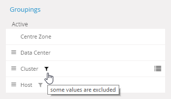
- Click the filter icon.
A list of available values for this grouping appears. - Find the values you want to add to the grouping and select them.
- Apply your changes.
The Baseline View regenerates with the additional data. In this way, you can also remove grouping values from the Baseline View.
When a segment is hidden, its usage data is not used in calculating the overall Baseline View usage. Before you restore a hidden segment, consider the effects it might have on your Baseline View.