Metric views
The Baseline View and Forward Thinking scenario models allow you to view a number of metrics for your IT infrastructure and to change which of these metrics are represented in the sunburst.
Available default metric views are:
When you select a metric, the segments and VMs in the sunburst change size and colour to show how that metric compares across your entire estate, or the sub-sections of the estate you selected to view. To learn more about the significance of the segment sizes and colours, see Application Interface.
It is important to always know which metric you have selected to be currently displayed in the sunburst so you can understand what your Baseline View or a scenario model is showing and how to interpret it.
Default measures are applied to each metric using the Model panel. To find out more about them, see Statistical summaries.
Apply a metric to the view Copied
When you first open your Baseline View or a Forward Thinking scenario model, it displays VM headroom by default. Applying a metric changes the priority of how your view displays data. The metric drop-down in the toolbar indicates the currently displayed metric.
To apply a different metric, follow these steps:
- Open your Baseline View or a Forward Thinking scenario model.
- Click the metric drop-down list in the top-left on the toolbar. By default, the list always displays the currently applied metric.
- Select the metric that you want to display in your view. For some types of metrics, they can be viewed as either configuration or usage category.
Click here to see an example
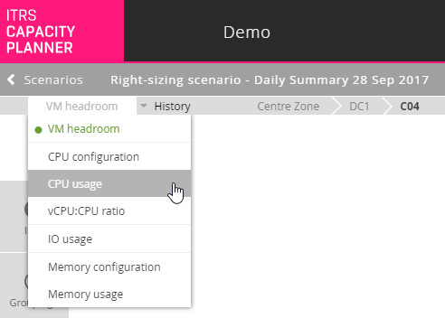
Your view is automatically updated to account for the new change in metric.
Available metrics Copied
Below, you can find a list of all available metrics that can be used with your baseline. The legend for the colours and segment sizes in the sunburst for the selected metric is shown below the sunburst. The legend changes depending on the metric selected. The icons used in the legend are as follows:
- Segment size
 — this icon and its description indicate what segment size represents in the sunburst for a particular metric view. For example, if you select the vCPU:CPU ratio metric, then the segment size represents the Host vCPU capacity.
 - Segment colour
 — this icon and its description indicate what segment colour represents in the sunburst for a particular metric view. For example, if you select the vCPU:CPU ratio metric, then the segment colours represent the vCPU:CPU ratio headroom.
 - VM size
 — this icon and its description indicate what the VM size represents in the sunburst for a particular metric view. For example, if you select the VM headroom metric, the VM size represents the Number of vCPUs.
 - VM colour
 — this icon and its description indicate what Vm colour represents in the sunburst for a particular metric view. For example, if you select the VM headroom metric, the VM colours represent the VM CPU headroom.
VM headroom Copied
The sunburst chart displays the VM headroom metric by default. This metric provides an indication of headroom for growth. Headroom growth is defined as how many more average VMs can be added to any given server before running into a capacity constraint.
The average VM is calculated by default across the whole Baseline View, and the capacity constraint reached could be CPU, memory, storage, or IO. The headroom is then communicated as a percentage of the currently hosted number of VMs in the Baseline View.
For example, if there are 10 VMs on a host, and there is capacity for 2 more VMs before reaching a CPU constraint, then there is space for 20% growth which means 20% headroom. The colour of the segment in the Baseline View reflects this value based on the colour scheme that you selected (for more information, see Sunburst colours).
This is how to interpret the sunburst when the VM headroom metric is selected:
- Segments:
- Segment size
— the segment size represents Host CPU capacity. The wider the segment, the more CPU capacity that segment (most likely a server) has available for use, relative to other segments.
- Segment colour
— the colour of each segment represents Host VM headroom in terms of how many more workloads of typical size can be added to that segment before reaching maximum capacity. Interpretation of the colour depends on the colour scheme that you are using.
- Segment size
- VMs:
- VM size
— the size of the VM circle represents Number of vCPUs. The larger the VM circle, the more vCPUs are allocated to that VM (relative to other VMs).
- VM colour
— the colour of each VM circle represents VM CPU headroom (relative to other VMs) in terms of how much more CPU that VM can use before reaching maximum capacity. Interpretation of the colour depends on the colour scheme that you are using.
- VM size
CPU configuration Copied
The CPU configuration metric makes it possible to view the relative CPU capacity available to each group, each group’s CPU headroom, and how much more CPU each VM can use.
- Segments:
- Segment size
— the segment size represents Host CPU capacity. The wider the segment, the more CPU capacity that segment (most likely a server) has available for use, relative to other segments.
- Segment colour
— the segment colour represents Host CPU headroom. This means it shows headroom in terms of how much more CPU could be consumed over and above current levels before reaching maximum capacity.
- Segment size
- VMs:
- VM size
— the size of the VM circle represents Number of vCPUs. The larger the VM circle, the more vCPUs are allocated to that VM (relative to other VMs).
- VM colour
— the colour of each VM circle represents VM CPU headroom (relative to other VMs) in terms of how much more CPU that VM can use before reaching maximum capacity. Interpretation of the colour depends on the colour scheme that you are using.
- VM size
CPU usage Copied
The CPU usage metric makes it possible to view how much CPU each group is using relative to other groups, each group’s CPU headroom, and how much vCPU demand is caused by each VM.
- Segments:
- Segment size
— the segment size represents Host CPU demand. The wider the segment, the more CPU that segment is using.
- Segment colour
— the segment colour represents Host CPU headroom. This means it shows headroom in terms of how much more CPU could be consumed over and above current levels before reaching maximum capacity.
- Segment size
- VMs:
- VM size
— the size of VM circles represents the relative CPU utilisation. The larger the circle, the more CPU utilisation from that VM.
- VM colour
— the colour of VM circles represents VM CPU headroom.
- VM size
vCPU:CPU ratio Copied
The vCPU:CPU ratio is the number of virtual machine vCPUs allocated compared to the number of physical CPU cores available. By default, the ratio is set to 8:1. Large number of VMs that are over-allocated can lead to increased resource contention.
To check how many more VMs you can fit based on the vCPU:CPU ratio, open the headroom details and hover the mouse over the vCPU:CPU ratio bar.
Click here to see an example
- Segments:
- Segment size
— the segment size represents the Host vCPU capacity. The wider the segment the more cores the group can fit.
- Segment colour
— the segment colour represents the vCPU:CPU ratio headroom. This shows how close this segment is to the ratio.
- Segment size
- VMs:
- VM size
— the size of the VM circle represents Number of vCPUs. The larger the VM circle, the more vCPUs are allocated to that VM (relative to other VMs).
- VM colour
— the colour of each VM circle represents VM CPU headroom (relative to other VMs) in terms of how much more CPU that VM can use before reaching maximum capacity. Interpretation of the colour depends on the colour scheme that you are using.
- VM size
IO usage Copied
The IO usage metric makes it possible to view how much IO demand is caused by each group relative to other groups, and how much IO demand is caused by each VM relative to the other VMs.
- Segments:
- Segment size
— the segment size represents Host IO demand. The wider the segment, the more IO demand that segment is causing.
- Segment colour
— the segment colour represents Host IO headroom. This shows IO demand relative to configured server IO capacity.
- Segment size
- VMs:
- VM size
— the size of VM circles represents VM IO demand. The larger the VM circle, the more IO demand that VM is generating.
- VM colour
— the colour of VM circles represents VM IO demand. This shows how much IO demand that VM is causing relative to other VMs in that group.
- VM size
Memory configuration Copied
The Memory configuration metric makes it possible to view the memory available to each group, each group’s memory headroom, and how much more memory each VM could use.
- Segments:
- Segment size
— the segment size represents Host memory capacity. The wider the segment, the more memory that segment has available for use relative to other segments.
- Segment colour
— the segment colour represents Host memory headroom in terms of how much more memory could be consumed over and above current levels before reaching maximum capacity.
- Segment size
- VMs:
- VM size
— the size of VM circles represents the comparative memory configuration of that VM.
- VM colour
— the colour of VM circles represents VM memory headroom.
- VM size
Memory usage Copied
The Memory usage metric makes it possible to view the memory used by each segment or VM, each entity’s headroom, and how much memory resource utilisation is generated by each VM.
- Segments:
- Segment size
— the segment size represents Host memory demand.
- Segment colour
— the segment colour represents Host memory headroom in terms of how much more memory could be consumed over and above current levels before reaching maximum capacity.
- Segment size
- VMs:
- VM size
— the size of VM circles represents VM memory demand in terms of how much demand that VM is placing on the allocated memory.
- VM colour
— the colour of VM circles represents VM memory headroom.
- VM size
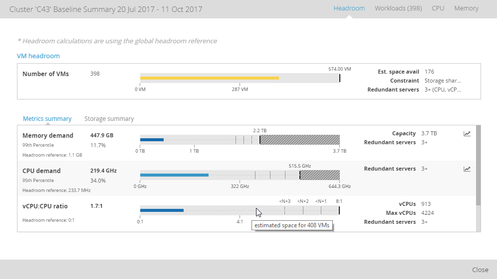
View detailed metrics of a grouping or VM Copied
You can view detailed metrics for the selected grouping or a VM. To do it, follow these steps:
- Right-click a segment or VM in the sunburst.
- From the menu, select Headroom. A baseline summary for the selected grouping or VM opens.
There is an option against each metric that allows you to view a time series chart. For CPU and memory, there are also options to open the drill-through box plot visualisations.
For more information about the data visible in the baseline summary window, see Headroom.