Application interface
In this section, you will learn about the graphical layout of Capacity Planner, names of panels, and other elements that appear on the screen.
The interface of Baseline Thinking and Capacity Planner is very similar. Most of the visible elements are the same, but the interactions with these elements may be different.
Capacity Planner landing page Copied
Once you log in and select a project, you are presented with the Capacity Planner landing page where you can select what you want to be working with.
By default, the first screen you see is the list of Baseline Views. You can use the menu on the left to select other screens: Forward Thinking scenarios, Reports and Dashboards (provided you have access to them).
You can decide how many rows to display and what sorting options to use. The menu on the left can be minimised.
Summary landing page Copied
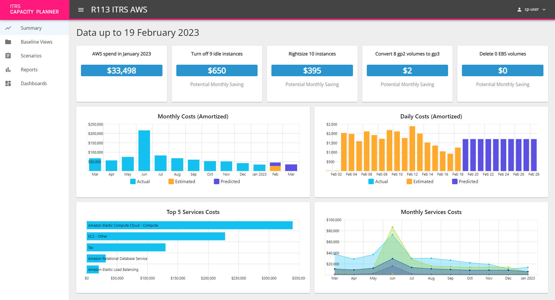
The AWS visual summary dashboard displays key information about the AWS state. This dashboard can be enabled if you are using an AWS solution. All the elements of the dashboard are click-through which means you can click them to see more information. For more information, see AWS summary dashboard.
Sunburst Copied
The sunburst is the central part of the screen where your Baseline View or Forward Thinking scenario is visualised.
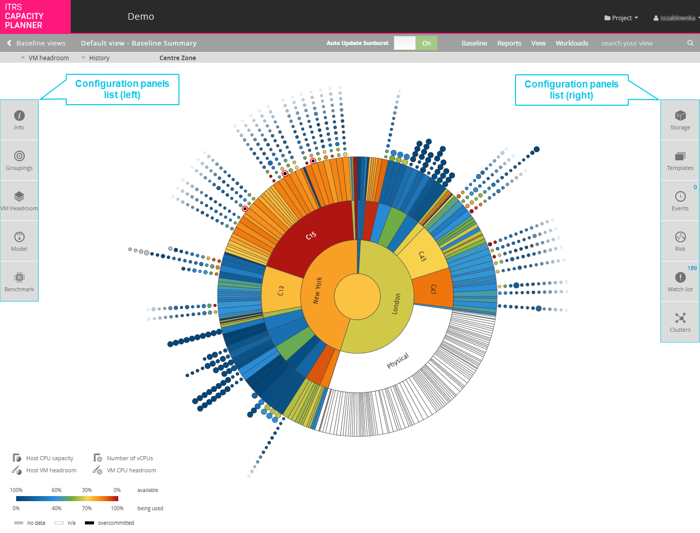
Graphically, the sunburst is divided into the following elements:
- Rings — represent groupings and can be rearranged.
- Segments — rings are divided into segments, each segment represents a grouping value.
- Centre circle — a segment of its own, with details that can be viewed just like any other segment.
- Small circles around the sunburst — represent your workloads.
Colours of the elements on the sunburst carry particular meaning . For more information, see Sunburst Colours.
You can switch from the sunburst to the timeburst view using the View menu in the application menu bar. Timeburst provides other options. For more information, see Timeburst.
Rings (groupings) Copied
The Baseline View separates your data into rings, all drawn round a central circle.

Groupings are slices of your data collected by a particular attribute. Each attribute is represented in a single grouping and is drawn as a ring on your Baseline View. All rings drawn round a central circle.
For more information, see Groupings.
Segments (grouping values) Copied
A grouping containing more than one value is split into segments for each value. The segments maintain the hierarchical structure between groupings in the Baseline View.
This means that if you have a ring representing the data centre grouping and then another ring representing the host grouping, the segments for each host are placed in such a way that you can easily see which host belongs to which data centre.

Each segment can be interacted with in a number of ways to reveal more information about the item it represents. To see the available options, right-click the segment.
For more information, see Groupings.
Centre zone Copied
The centre zone is a segment of its own, with details that can be viewed just like any other segment. When you first open the Baseline View, the centre circle represents your whole IT infrastructure and is called the Centre Zone. When you zoom into any of the segments, the centre circle changes to represent that segment.

Small circles (workloads) Copied
In a virtualised environment, a circle represents a virtual machine (VM). In a physical environment, the circle represents the analysed workload from that server. If there are multiple workloads shown for a physical server that is not part of a virtualised environment, then each workload represents an individual process running on that machine.
Workloads are drawn within the boundaries of their parent segment. This means that it is also clear which of the other groupings the workloads belong to, whether it is a host, data centre, cluster, or something else.

Each workload can be interacted with in a number of ways to reveal more information about the item it represents. Right click the workload, to see the available options.
Timeburst Copied
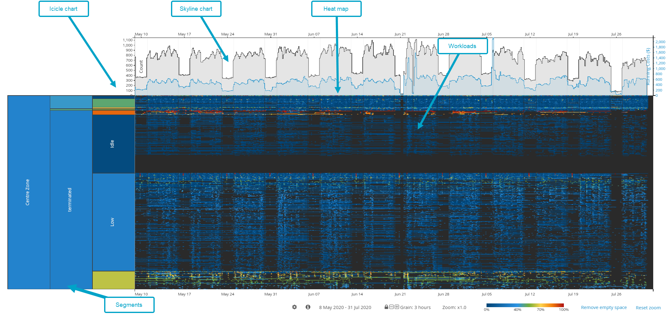
The timeburst is a rectangular representation of the sunburst with segments displayed in the same hierarchy. Graphically, it is divided into the following elements:
- The icicle chart with segments on the left-hand side.
- Radiating outwards, there is a line for every workload. The line goes from the beginning of the data and gives you an indication of when these workloads were running.
- If you hover over a workload, you can see its details on the left-hand side.
- To the right of the segments is the heat map of the workload utilisation.
- Along the top of the chart is a skyline chart which displays the number of workloads that were running at a given point of time and their running costs. By default, daily granularity is displayed.
- Each entry in a cell is a machine that has been running during that day.
Top navigation Copied
There are three navigation bars at the top of the screen:
- Project menu bar
- Application menu bar
- Toolbar
Project menu bar Copied
The project menu bar is located at the very top of the screen. It allows you to interact with your project and user settings. For more information, see Project setup.

Application menu bar Copied
Application menu bar allows you to interact with your Baseline View or Forward Thinking scenario model. The various options on this bar allow you to do the following:
- Disable sunburst auto update when changing groupings.
- Export workload or server CSV files.
- Create new views or save the existing one.
- Generate reports.
- Change sunburst colour schemes.
- Remove labels and workloads from the visualization.
- Switch between sunburst and timeburst view.
- Search your view for specific entities using the search bar. As you type, the suggested results start appearing. You can right-click an entity directly from the search results and select a required option from the menu that appears.

Toolbar Copied
In the toolbar, you can perform the following actions:
- Change which metric is displayed in the sunburst. In the toolbar, you always see the name of the metric that is currently displayed. Click the metric name to see a list of all available metrics.
For more information, see Metric views. - Check which segments you zoomed into in your current session. To do it, click History. From here you can directly open one of the segments.
- Navigate through the segments that you zoom in to. When you zoom in to a segment, your navigation path appears as breadcrumbs. You click a breadcrumb, to go out of the current segment. To exit the current segment, click on a breadcrumb. To return to the view of the whole sunburst, click Centre Zone.
For more information about zooming, see Interact with the Sunburst and Interact with the Timeburst.

Configuration panels list Copied
On the left and right sides of the screen, there are two configuration panels lists. These panels enable you to make changes to the Baseline View and to see detailed information.
For more information about available panels, see Configuration panels.
Legend Copied
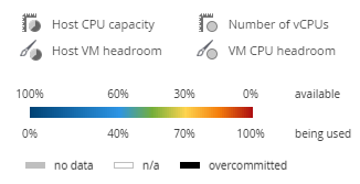
The legend on the screen helps you interpret what you see in the sunburst at any given moment:
- It provides additional explanation of what the colours and segment sizes refer to. For more information, see Available metrics.
- It shows what you what the colours of the segments mean. When you hover your mouse over any segment in the sunburst, a black indicator appears in the sunburst legend that gives you a more exact percentage of available and used capacity. For more information, see Sunburst colours.
Timeline Copied
Timeline appears only on the Forward Thinking scenario screen. It is located below the sunburst and displays all the operations that are applied to the Baseline View over time.
For more information, see Operations.
