Metrics Explorer
Metrics Explorer enables you to explore metrics for all of your entities. It uses the currently configured hierarchy in the sunburst. This means that when you select a point in the hierarchy, you can then explore the metrics from this point on.
Using Metrics Explorer you can compare different time series. The values that you can explore are:
- Daily measures
- 5 minute data
- Absolute values or percentages
Navigate the Metrics Explorer window Copied
To open Metrics Explorer:
- Right-click an entity in the sunburst.
- Select Metrics Explorer from the menu.
The Metrics Explorer window displays the details of the metrics for the entity that you selected. You can perform the following actions:
- Using the breadcrumbs at the top of the window, you can navigate between entities the same way you do in the sunburst.
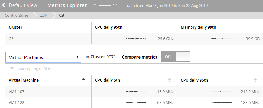
- In the top table, you can see metrics for the entity you selected (for example, 95th percentile, and headroom). These are daily measures.
- In the bottom table, you can see detailed metrics for the entities from the point of the hierarchy where you opened Metrics Explorer. Each column represents a metric.
- You can double-click an entity to see other entities and metrics associated with the selected entity. For example, if you double-click a host, only the VMs associated with that host are displayed.
- Using the drop-down above the metrics table, you can navigate down the sunburst hierarchy. For example:
- If your hierarchy is Data centre > Cluster > Host > VM, and you choose to view Metrics Explorer for the data centre, you will first see the list of clusters and their metrics. Using the drop-down, you can then go down the hierarchy to the hosts, and then to VMs.
- If you are in a cluster, you can look directly at the VMs.
- Compare metrics by switching this option on or off. For more information, see Compare metrics.
- Change the metrics you are viewing. To do that, click
 and select Edit columns. For more information, see Compare metrics.
 - Export the data currently displayed on the screen as CSV.
To close Metrics Explorer and go back to the Baseline View, click Default view in the breadcrumbs.
Change the displayed metrics Copied
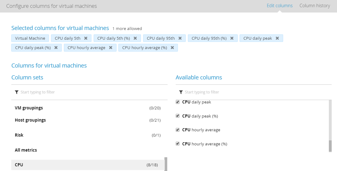
Each column in the Metrics Explorer represents one measure. You can change what metrics appear by adding, removing, or changing their order. To do that, click ![]() and select Edit columns. The maximum number of metrics that you can view is 9.
and select Edit columns. The maximum number of metrics that you can view is 9.
The configuration window is divided into two sections:
- Columns sets on the left
- Available columns on the right

Metrics are grouped into Column sets based on what entity you are viewing in the hierarchy. Clicking a set displays available measures in the Available columns section on the right.
- Groupings — depending on an entity you are viewing, this can be Host groupings or VM groupings. Click a set and available groupings are displayed on the right.
- Risk — you can add a risk score measure to the metrics explorer.
- All metrics — if you click this set, all metrics are displayed in the Available columns section. To concentrate only on specific metrics, you can select from the available subsets.
Columns are configured separately for each entity. For example, if you are currently viewing metrics for hosts, the changes that you make only apply to hosts.
Understand the metrics Copied
When reading, analysing, and comparing measures that are displayed in Metrics Explorer, you need to understand the following:
- A sparkline shows the most recent activity of the metric. By default, it is the last 30 data points. For example, if you are looking at daily measures, this is 30 days; if you are looking at 5 minute data, it is 150 minutes.
- Clicking a cell with a sparkline opens the time series for that metric. For more information, see View time series.
- Values that appear for the daily metrics are the values of that measure for the current baseline. These values are displayed next to the sparkline.
- This is the same value you can see when looking at the Headroom dialog window of the sunburst for that machine.
- In 5 minute detail time series metrics, the value is the latest known value of that metric.
- Headroom measures always display the current value.
Example Copied
Always make sure that you have the right metrics selected and that you understand them in order to arrive at the right conclusions. Let’s consider the following example scenario:
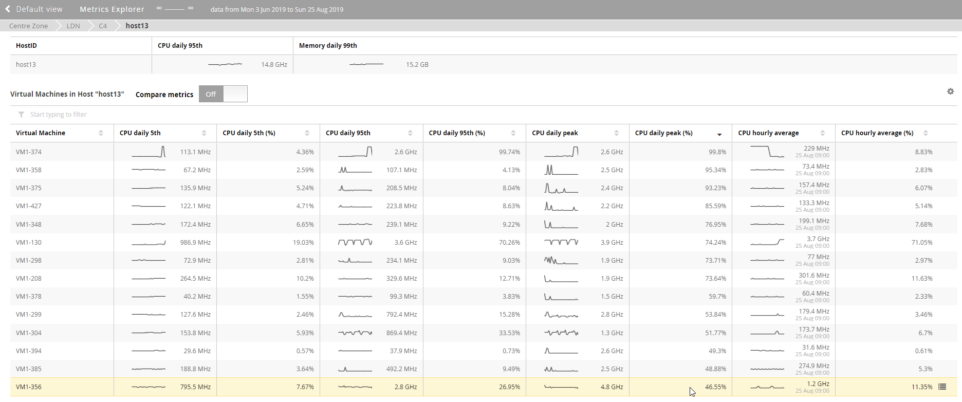
You want to check which of your VMs generates the most CPU and as a result, is close to its capacity.
- You add the CPU metrics to your view in Metrics Explorer.
- You sort the list to show you the machine with the highest CPU daily peak.
- VM1-356 is the machine that consumes the most CPU as shown in the image below.
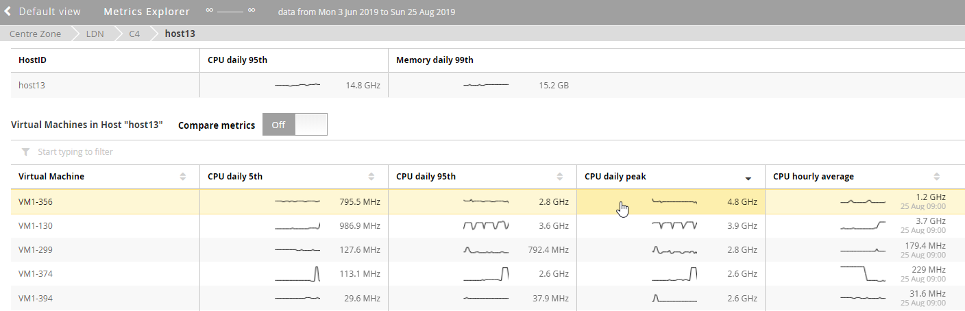
However, this data is not showing whether this machine is close to its capacity. It can be a big machine, but it may not be close to capacity even if its CPU daily peak is the highest.
Capacity is the percentage measure so you need to add it to your columns.
Sort the results again, this time to see which machine has the highest CPU daily peak (%). In this example, you can now see that the machine called VM1-374 is consuming 99.8% of CPU which means its reached its capacity.
The machine that you looked at before, VM1-356, is only consuming 46.55%, and is now at the bottom of the list.
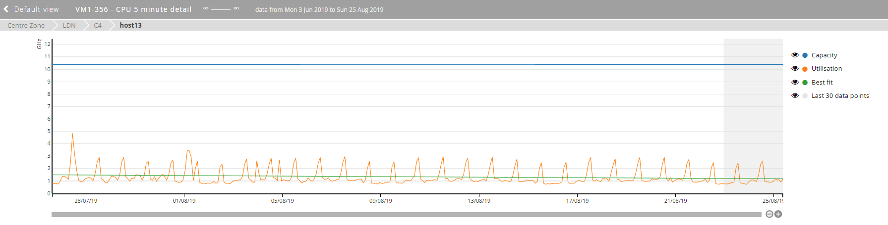
View time series Copied
To view detailed time series of a selected metric, click the cell within that metric. Time series exist only for metrics for which a sparkline is displayed.
Below are example settings that you can apply when analysing your data:
- Switch Utilisation and Capacity on and off.
- Order by CPU daily peak and use 5 minute detail to see when that peak occurred.
- Look for your daily average.
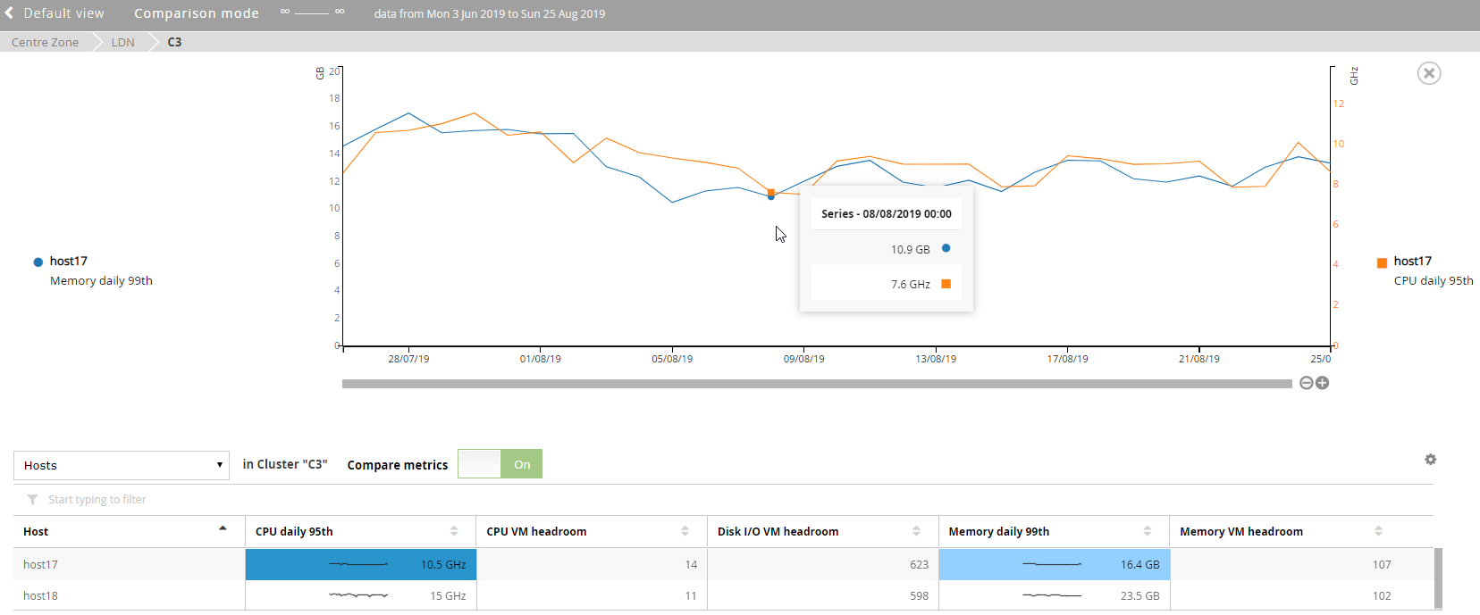
- Click Compare metrics and select another metric, either from another VM or the same VM to see them both on the same graph.
To close times series, click the X button.
Dynamically calculated time series Copied
The metric that is dynamically calculated is the 5 minute detail. You can use it to calculate aggregated time series.
When viewing time series for this metrics, you can check the Best fit line which indicates if there are any trends.
Compare metrics Copied
To compare two metrics on the time series graph:
- Toggle the Compare metrics slider to On.
- Click the two metrics that you wish to compare.
- You can compare metrics from two different VMs or from the same VM.
- You can switch between the metrics that you are comparing without leaving the time series view.
Each metric is displayed on the graph with a different colour.
When comparing metrics, the scale of the graph may change to fit all the data.